Silvariations - Starry Lake

More Posts from Silvariations and Others
Everyone wants more gay parents on TV and yet no one ever talks about the best gay dads in all of cinema history.

so for some reason hershey’s thinks that golden apples would be great to sell as valentine’s candy
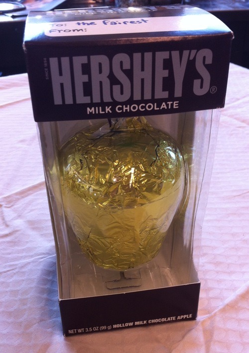
so i got one and wrote this on top:

and left it on a table in the studio

less than five minutes later people were fighting about it
my plan has thus far been a success


The references for the three Dreamers! Don't worry. I'll infodump later, for now, I am just posting reference pictures as I finish them.
A (Somewhat Incomplete) Guide on How to Fake Sinner Profiles


LIMBUSIFY YOUR ARTSTYLE (optional)
The core components of limbus companies artstyle are as follows:
Textured, ink pen like lineart
Desaturated colours leaning towards the outermost area of the colour square
Cell shading with some texture
lots and lots of visual effects. God have mercy
Keep references around while drawing, as there are often lots of small details and these will be your guide for not going too crazy with your noise effects.
2. BACKGROUNDS
In the interest of saving time, here’s a free template for you to use. Feel free to change up the background colour however
Key notes:
The background colour loosely matches to the sinner’s eye colour, however usually slightly more saturated.
the outer border is lined thinly by black. This also covers the limbus logo section.
3. TEXT
The font for the light yellow text for your sinners weapon is Futura Condensed Medium. There’s a slight black backdrop to it you can get from duplicating the text and lowering it slightly.

4. EFFECTS
Sharpen, noise and blur will be your best friends here. Too high quality of a character sprite can make it not mesh with the background, and look odd when matched with canon portraits. Here’s a step by step process:
Add wear to the portrait with textured brushes, low opacity and blending modes. I’d generally suggest using gouache or watercolour brushes very lightly to establish texture, then going back in more strongly to indicate dirt and grime. Always use a coloured shadow.
using a blur filter, blur your character on the lowest setting possible, to the point it’s almost unnoticeable.
If your program has a layer texture filter, switch to the noise option and lightly cover the portrait with a thin layer of noise texture. If not, use your pen’s texture settings OR download a png of noise texture and set the layer it’s on to multiply, then lowering the opacity to around %5-10.
Apply a sharpening filter very lightly, only to the point where when zoomed in light colour separation and grain from the lineart can be seen.
aside from that, I’d always recommend playing around with colours, light and textures to make the portrait fit closer.
In the end, it can look something like this!

To conclude this, have fun, go crazy, and suggestions on how to improve this guide are very much encouraged.
Did you know that the eyes of frankenstein's monster are yellow, and that Frankenstein rejected him for it? Angela and Ayin's eyes are also yellow. The monster actively chooses to murder several people just to exact his petty revenge, blaming his creator for his actions.
The way Angela is willing to receive lots and lots of guests just to find the one true book, does that seem a little familiar to you?

For whatever cause, the ends do not justify the means. They are both monsters of their own stories, until they both decide to break this cycle.
As the person who sent that, I am willing to find Roland and murder him for taking away Jae-Heon's attempt at bringing back his son 😌
I truly believe Jae-Heon did nothing wrong and will fight anyone who disagrees
- Sincerely, a Jae-Heon fan
My sincerest thanks, you really know how to flatter a man. If anyone wishes to complain to me about anything I've done, I will redirect you to the anon in this post. 🧵

I will not elaborate
(BTW: this was made MEBI's reblogs 👍)

(A coffin arrives.)
Viktor: It’s a coffin. There’s a name engraved on it.
*shows the name*
WHORE. It’s empty!
*grabs Lord Transyl*
AND YOU’RE GOING IN IT!
VIKTOR HAND-CRAFTED IT THEN MAILED IT TO HIMSELF JUST TO SAY THIS

-
 sweettreatrainbows liked this · 2 months ago
 -
 mysterious-shadow-dragon liked this · 3 months ago
 -
 eddsworldtom1234 liked this · 3 months ago
 -
 butterflyjray liked this · 3 months ago
 -
 stunning-eclipse liked this · 5 months ago
 -
 buttercup-art liked this · 5 months ago
 -
 wittness reblogged this · 5 months ago
 -
wittness liked this · 5 months ago
-
 blushdotpng reblogged this · 6 months ago
 -
blushdotpng liked this · 6 months ago
-
 mentola01 liked this · 6 months ago
 -
 praisehakumennomono liked this · 7 months ago
 -
 nightmare254 reblogged this · 10 months ago
 -
nightmare254 liked this · 10 months ago
-
 thatonerandomindiekid liked this · 10 months ago
 -
 that-one-fangirl123 liked this · 11 months ago
 -
 a-little-ray-of-fantasy reblogged this · 11 months ago
 -
 polaris107 liked this · 11 months ago
 -
 pajarraco-is-silly liked this · 1 year ago
 -
 starcrossedparts liked this · 1 year ago
 -
 jess-the-ink-monster-blog liked this · 1 year ago
 -
 buggmintz liked this · 1 year ago
 -
a-little-ray-of-fantasy liked this · 1 year ago
-
 ivegotamulletstanford liked this · 1 year ago
 -
 snappycity liked this · 1 year ago
 -
 icilarastudios liked this · 1 year ago
 -
 angel-the-blocker reblogged this · 1 year ago
 -
 ethanthespookymonth liked this · 1 year ago
 -
 rabid-mercenary17 liked this · 1 year ago
 -
 acethebubblewrappartical liked this · 1 year ago
 -
 extrascaring liked this · 1 year ago
 -
 medialtp liked this · 1 year ago
 -
 the-crazy-st4r liked this · 1 year ago
 -
 legendpaw12 reblogged this · 1 year ago
 -
legendpaw12 liked this · 1 year ago
-
 mushen-mah liked this · 1 year ago
 -
 silentzepher liked this · 1 year ago
 -
 boxychoasbird liked this · 1 year ago
 -
 lazy-idiot reblogged this · 1 year ago
 -
 anarchistzim liked this · 1 year ago
 -
 how-does-this-work6969 reblogged this · 1 year ago
 -
 marionette2008 liked this · 1 year ago
 -
 pokeseal liked this · 1 year ago
 -
 rebecca-arts liked this · 1 year ago
 -
 yourlocalmenacetm reblogged this · 1 year ago
