Your gateway to endless inspiration
Art Reference - Blog Posts
random thing but i realized it might be helpful for some people so uh. theres this thingy where you can upload an image and it gives you a color palette based on it !
heres an example

and it also gives you the hex code values for them too its p neat !
here’s the link to the website !
RESOURCES FOR POSES
Line of Action

JustSketch.Me

PoseManiacs

Human-Anatomy-For-Artist.com

MagicPoser

MIXAMO

Pose Archives

Bodies in Motion

Posemy.art

ReferenceAngle

CroquisCafe

hot artists don't gatekeep
I've been resource gathering for YEARS so now I am going to share my dragons hoard
Floorplanner. Design and furnish a house for you to use for having a consistent background in your comic or anything! Free, you need an account, easy to use, and you can save multiple houses.
Comparing Heights. Input the heights of characters to see what the different is between them. Great for keeping consistency. Free.
Magma. Draw online with friends in real time. Great for practice or hanging out. Free, paid plan available, account preferred.
Smithsonian Open Access. Loads of free images. Free.
SketchDaily. Lots of pose references, massive library, is set on a timer so you can practice quick figure drawing. Free.
SculptGL. A sculpting tool which I am yet to master, but you should be able to make whatever 3d object you like with it. free.
Pexels. Free stock images. And the search engine is actually pretty good at pulling up what you want.
Figurosity. Great pose references, diverse body types, lots of "how to draw" videos directly on the site, the models are 3d and you can rotate the angle, but you can't make custom poses or edit body proportions. Free, account option, paid plans available.
Line of Action. More drawing references, this one also has a focus on expressions, hands/feet, animals, landscapes. Free.
Animal Photo. You pose a 3d skull model and select an animal species, and they give you a bunch of photo references for that animal at that angle. Super handy. Free.
Height Weight Chart. You ever see an OC listed as having a certain weight but then they look Wildly different than the number suggests? Well here's a site to avoid that! It shows real people at different weights and heights to give you a better idea of what these abstract numbers all look like. Free to use.
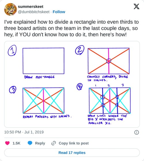
really helpful technique ^ once you know how to divide by halves and thirds it makes drawing evenly spaced things in perspective waaay easier:
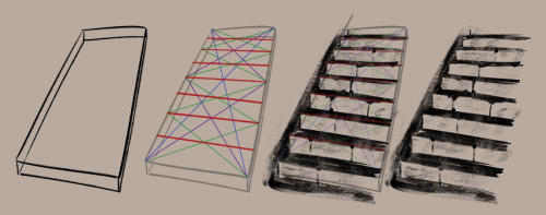
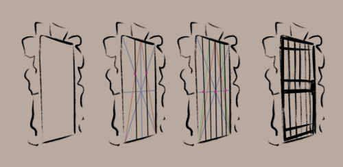
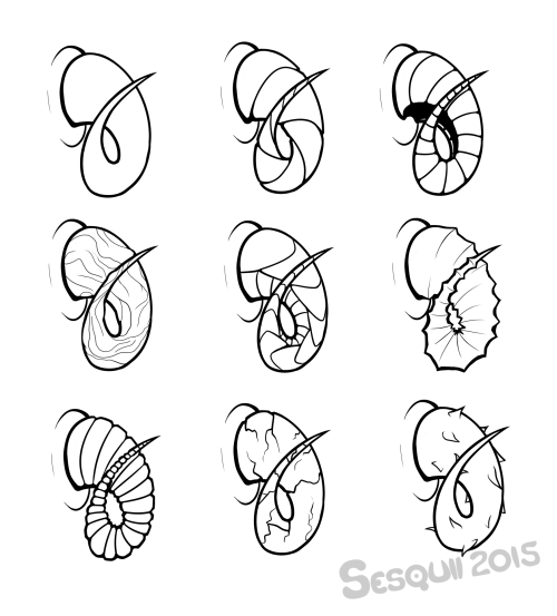
RadenWA is honestly a hero for these


they're got even more than these, too!
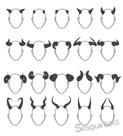
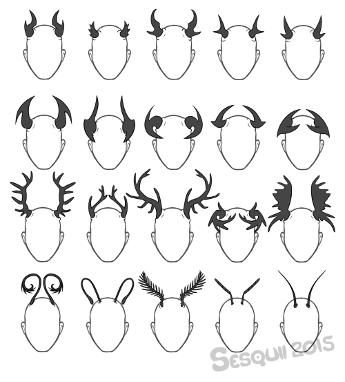
I really like horns, so here, have a set horns, antlers and feelers! Feel free to use as a reference or inspiration, no need to credit. :)
Note to Self - Speaking without Words with Word Balloons
Word gallons are for more than just words. They can be used to emphasis and even add emotions and to a scene
Feeling dizzy? About to pass out?

A lilting playful swirl (Time and Time Again by Deo I)

The white and black of the text has been replaced with a sinister black and the words are off tilter (Sword Interval by Benjamin Fleuter)

The voice is coming from a place deeper and more unsettling and the text is uneven and handwritten

A dismissive comment literally (metaphorically) stabs someone (Marionetta by Míriam Bonastre Tur)
Being interrupted before finishing what is being said

A withering and icy reply (The Secrets of Soulford by the Quincil)

Wobbly uncertain bubbles that even break apart in some parts from dizziness (The Blind Prince by cozycroww)
Pain almost appears to be breaking the usually round bubble into uneven and broken balloons. The little smaller balloons around it are reminiscent of sweat or tears (Heir’s Game by suspu)


More art tutorials by Disney artists Griz and Norm Lemay
@a-hungruy-alien there’s second part!
Part 2: shape, style, and length with femme styles!


Part 3: Combining shapes, braids, and textures! And utilizing parts and fros!


art tips post
for all the artist following me
Have two sketchbooks: One for finished and high-quality art (stuff made with Prismacolor or Copic if you use that or art for your portfolio) and the other sketchbook for more messy doodles. This way you have a place to try new things and mess up as much as you need. When I only had one sketchbook I was scared to draw in it because I didn't want to mess it up
Do studies. I cant tell you how much I've improved just by doing studies of shoes, hands, noses, and all that. This works for when you have art block too since you’re not really making stuff up and just learning how real things work.
Learn from others. I’ve never taken a real art class because 1. I can’t afford it and 2. there’s no good art classes/programs at my school. I’ve been following several artists and learning from them over the years and they’ve helped me tremendously. Just please do not steal art because that is never okay.
Break down concepts. If you notice there’s something wrong with your piece then figure out why. You can’t get better if you leave mistakes and don't try to understand whats going on. If the color is weird figure out if the values look right or maybe its the saturation of the color.
Watch youtube tutorials. Here are some youtubers I think are pretty good art teaching all things art: Draw with Jazza | DrawingWiffWaffles | Proko | Baylee Jae
Have an inspiration folder/blog. Sometimes you just need a collection of starry nights or a misty forest or even a French bakery. All of those things can help you get inspired to draw. It could even be completely unrelated to what you plan to draw.
There are no dumb ideas in the creative process. If you want to draw a lizard in a dress go for it! If you want to draw various pastries with faces do it! Don’t let the thought of it being too dumb stop you because if I’ve learned anything in my several years of drawing it’s that an idea can lead to another and another and another and you may get a really good idea just from doodling dumb things.
Here’s a few things that can get you started on drawing better:
Dynamic poses | Dynamic clothes | Dynamic figure drawing
COMPOSITION | PERSPECTIVE | CONSTRUCTION
Anatomy:
Legs
Arms
Hands
Heads
Body (Female) (Male
Color Theory
Improving your sketchbook
Most importantly, don’t give up! You may not immediately get notes or followers but it’s more important you get better than to have popularity. How do you think those popular artists got to where they are now? To be good you’ve got to work at it.


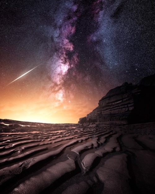
If you could live forever, would you? Sunset Cliffs, San Diego.

#TBT NEW/OLD s1 Dom and Kat via @shadowhunterstv


Marvel’s Cloak and Dagger Tandy Bowen actress Olivia Holt in Vera Wang with House of Emmanuele jewelry photographed by Elias Tahan for Schön! Magazine # 34, March 2018.

The blood moon is framed by the statues of Hera and Apollo in Athens, 27 July 2018 (x)

@Kat_McNamara: First I drink the coffee, then I do the things… ☕️

A Madagascar sunset moth. It is considered one of the most impressive and appealing-looking lepidopterans.
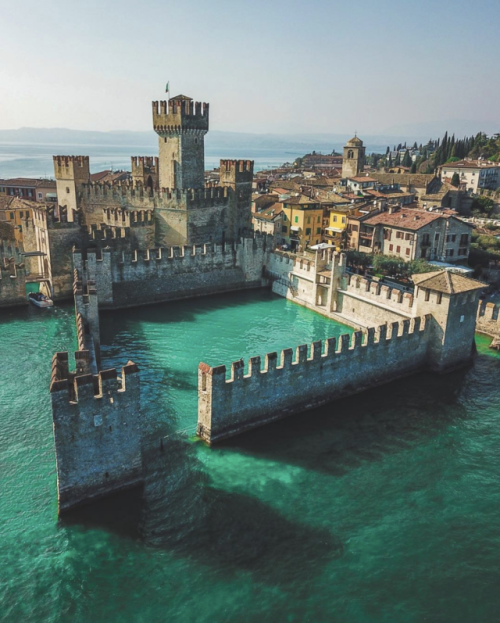
Rocca Scaligera di Sirmione in Italy. A unique 13th-century castle surrounded by water, with steep climbs leading to scenic lake views. (Source)


You can say that again Buddy! Humans are so crazy unique that it's not even funny!
I want to tell a story to the artists and would-be artists out there.
When I was 19, I made a large oil painting of the nerd I would eventually marry. I poured all my attention and care into this painting. It's the only art I have from back then that still holds up as a work I'm proud of today.
I entered it into a judged show at the local art center. It got an honorable mention. I went to see the show with my beloved model. One of the judges came up to talk to me, and highlighted that all the judges really liked the painting. It would have placed, except, you see, the feet were incorrect. They were too wide and short, and if I just studied a bit more anatomy-
I called over my future wife, and asked her to take off her shoe. Being already very used to humoring me, she did. The judge looked at her very short, very wide little foot. Exactly as I'd lovingly rendered it. I would never edit her appearance in any way.
The judge looked me in the eye, and to his credit, he really looked like he meant it when he said "Oh I'm so sorry."
Anyways the moral of the story is that all of those anatomy books that teach you proportions are either showing you averages, or a very specific idea of an idealized body. Actual bodies are much more varied than that.
So don't forget to draw from observation, and remember that humans aren't mass produced mannequins. Delight in our variation. Because it's supposed to be there.


“Thinking about compression from a side view”
Source: Anime Private School on Twitter
Excuse me while I reblog this for future reference...
Words for Skin Tone | How to Describe Skin Color
We discussed the issues describing People of Color by means of food in Part I of this guide, which brought rise to even more questions, mostly along the lines of “So, if food’s not an option, what can I use?” Well, I was just getting to that!
This final portion focuses on describing skin tone, with photo and passage examples provided throughout. I hope to cover everything from the use of straight-forward description to the more creatively-inclined, keeping in mind the questions we’ve received on this topic.
Standard Description
Basic Colors

Pictured above: Black, Brown, Beige, White, Pink.
“She had brown skin.”
This is a perfectly fine description that, while not providing the most detail, works well and will never become cliché.
Describing characters’ skin as simply brown or beige works on its own, though it’s not particularly telling just from the range in brown alone.
Complex Colors
These are more rarely used words that actually “mean” their color. Some of these have multiple meanings, so you’ll want to look into those to determine what other associations a word might have.

Pictured above: Umber, Sepia, Ochre, Russet, Terra-cotta, Gold, Tawny, Taupe, Khaki, Fawn.
Complex colors work well alone, though often pair well with a basic color in regards to narrowing down shade/tone.
For example: Golden brown, russet brown, tawny beige…
As some of these are on the “rare” side, sliding in a definition of the word within the sentence itself may help readers who are unfamiliar with the term visualize the color without seeking a dictionary.
“He was tall and slim, his skin a russet, reddish-brown.”
Comparisons to familiar colors or visuals are also helpful:
“His skin was an ochre color, much like the mellow-brown light that bathed the forest.”
Modifiers
Modifiers, often adjectives, make partial changes to a word.The following words are descriptors in reference to skin tone.
Dark - Deep - Rich - Cool
Warm - Medium - Tan
Fair - Light - Pale
Rich Black, Dark brown, Warm beige, Pale pink…
If you’re looking to get more specific than “brown,” modifiers narrow down shade further.
Keep in mind that these modifiers are not exactly colors.
As an already brown-skinned person, I get tan from a lot of sun and resultingly become a darker, deeper brown. I turn a pale, more yellow-brown in the winter.
While best used in combination with a color, I suppose words like “tan” “fair” and “light” do work alone; just note that tan is less likely to be taken for “naturally tan” and much more likely a tanned White person.
Calling someone “dark” as description on its own is offensive to some and also ambiguous. (See: Describing Skin as Dark)
Undertones
Undertones are the colors beneath the skin, seeing as skin isn’t just one even color but has more subdued tones within the dominating palette.
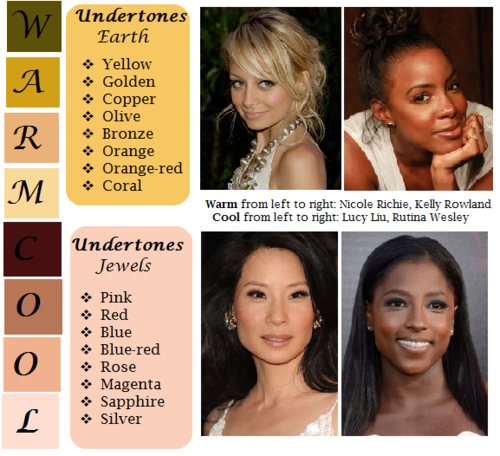
pictured above: warm / earth undertones: yellow, golden, copper, olive, bronze, orange, orange-red, coral | cool / jewel undertones: pink, red, blue, blue-red, rose, magenta, sapphire, silver.
Mentioning the undertones within a character’s skin is an even more precise way to denote skin tone.
As shown, there’s a difference between say, brown skin with warm orange-red undertones (Kelly Rowland) and brown skin with cool, jewel undertones (Rutina Wesley).
“A dazzling smile revealed the bronze glow at her cheeks.”
“He always looked as if he’d ran a mile, a constant tinge of pink under his tawny skin.”
Standard Description Passage
“Farah’s skin, always fawn, had burned and freckled under the summer’s sun. Even at the cusp of autumn, an uneven tan clung to her skin like burrs. So unlike the smooth, red-brown ochre of her mother, which the sun had richened to a blessing.”
-From my story “Where Summer Ends” featured in Strange Little Girls
Here the state of skin also gives insight on character.
Note my use of “fawn” in regards to multiple meaning and association. While fawn is a color, it’s also a small, timid deer, which describes this very traumatized character of mine perfectly.
Though I use standard descriptions of skin tone more in my writing, at the same time I’m no stranger to creative descriptions, and do enjoy the occasional artsy detail of a character.
Creative Description
Whether compared to night-cast rivers or day’s first light…I actually enjoy seeing Characters of Colors dressed in artful detail.
I’ve read loads of descriptions in my day of white characters and their “smooth rose-tinged ivory skin”, while the PoC, if there, are reduced to something from a candy bowl or a Starbucks drink, so to actually read of PoC described in lavish detail can be somewhat of a treat.
Still, be mindful when you get creative with your character descriptions. Too many frills can become purple-prose-like, so do what feels right for your writing when and where. Not every character or scene warrants a creative description, either. Especially if they’re not even a secondary character.
Using a combination of color descriptions from standard to creative is probably a better method than straight creative. But again, do what’s good for your tale.
Natural Settings - Sky

Pictured above: Harvest Moon -Twilight, Fall/Autumn Leaves, Clay, Desert/Sahara, Sunlight - Sunrise - Sunset - Afterglow - Dawn- Day- Daybreak, Field - Prairie - Wheat, Mountain/Cliff, Beach/Sand/Straw/Hay.
Now before you run off to compare your heroine’s skin to the harvest moon or a cliff side, think about the associations to your words.
When I think cliff, I think of jagged, perilous, rough. I hear sand and picture grainy, yet smooth. Calm. mellow.
So consider your character and what you see fit to compare them to.
Also consider whose perspective you’re describing them from. Someone describing a person they revere or admire may have a more pleasant, loftier description than someone who can’t stand the person.
“Her face was like the fire-gold glow of dawn, lifting my gaze, drawing me in.”
“She had a sandy complexion, smooth and tawny.”
Even creative descriptions tend to draw help from your standard words.
Flowers
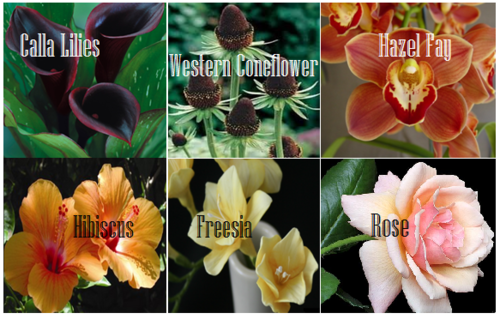
Pictured above: Calla lilies, Western Coneflower, Hazel Fay, Hibiscus, Freesia, Rose
It was a bit difficult to find flowers to my liking that didn’t have a 20 character name or wasn’t called something like “chocolate silk” so these are the finalists.
You’ll definitely want to avoid purple-prose here.
Also be aware of flowers that most might’ve never heard of. Roses are easy, as most know the look and coloring(s) of this plant. But Western coneflowers? Calla lilies? Maybe not so much.
“He entered the cottage in a huff, cheeks a blushing brown like the flowers Nana planted right under my window. Hazel Fay she called them, was it?”
Assorted Plants & Nature

Pictured above: Cattails, Seashell, Driftwood, Pinecone, Acorn, Amber
These ones are kinda odd. Perhaps because I’ve never seen these in comparison to skin tone, With the exception of amber.
At least they’re common enough that most may have an idea what you’re talking about at the mention of “pinecone.“
I suggest reading out your sentences aloud to get a better feel of how it’ll sounds.
"Auburn hair swept past pointed ears, set around a face like an acorn both in shape and shade.”
I pictured some tree-dwelling being or person from a fantasy world in this example, which makes the comparison more appropriate.
I don’t suggest using a comparison just “cuz you can” but actually being thoughtful about what you’re comparing your character to and how it applies to your character and/or setting.
Wood
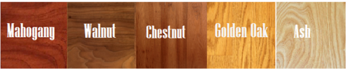
Pictured above: Mahogany, Walnut, Chestnut, Golden Oak, Ash
Wood can be an iffy description for skin tone. Not only due to several of them having “foody” terminology within their names, but again, associations.
Some people would prefer not to compare/be compared to wood at all, so get opinions, try it aloud, and make sure it’s appropriate to the character if you do use it.
“The old warlock’s skin was a deep shade of mahogany, his stare serious and firm as it held mine.”
Metals

Pictured above: Platinum, Copper, Brass, Gold, Bronze
Copper skin, brass-colored skin, golden skin…
I’ve even heard variations of these used before by comparison to an object of the same properties/coloring, such as penny for copper.
These also work well with modifiers.
“The dress of fine white silks popped against the deep bronze of her skin.”
Gemstones - Minerals
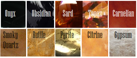
Pictured above: Onyx, Obsidian, Sard, Topaz, Carnelian, Smoky Quartz, Rutile, Pyrite, Citrine, Gypsum
These are trickier to use. As with some complex colors, the writer will have to get us to understand what most of these look like.
If you use these, or any more rare description, consider if it actually “fits” the book or scene.
Even if you’re able to get us to picture what “rutile” looks like, why are you using this description as opposed to something else? Have that answer for yourself.
“His skin reminded her of the topaz ring her father wore at his finger, a gleaming stone of brown, mellow facades.”
Physical Description
Physical character description can be more than skin tone.
Show us hair, eyes, noses, mouth, hands…body posture, body shape, skin texture… though not necessarily all of those nor at once.
Describing features also helps indicate race, especially if your character has some traits common within the race they are, such as afro hair to a Black character.
How comprehensive you decide to get is up to you. I wouldn’t overdo it and get specific to every mole and birthmark. Noting defining characteristics is good, though, like slightly spaced front teeth, curls that stay flopping in their face, hands freckled with sunspots…
General Tips
Indicate Race Early: I suggest indicators of race be made at the earliest convenience within the writing, with more hints threaded throughout here and there.
Get Creative On Your Own: Obviously, I couldn’t cover every proper color or comparison in which has been “approved” to use for your characters’ skin color, so it’s up to you to use discretion when seeking other ways and shades to describe skin tone.
Skin Color May Not Be Enough: Describing skin tone isn’t always enough to indicate someone’s ethnicity. As timeless cases with readers equating brown to “dark white” or something, more indicators of race may be needed.
Describe White characters and PoC Alike: You should describe the race and/or skin tone of your white characters just as you do your Characters of Color. If you don’t, you risk implying that White is the default human being and PoC are the “Other”).
PSA: Don’t use “Colored.” Based on some asks we’ve received using this word, I’d like to say that unless you or your character is a racist grandmama from the 1960s, do not call People of Color “colored” please.
Not Sure Where to Start? You really can’t go wrong using basic colors for your skin descriptions. It’s actually what many people prefer and works best for most writing. Personally, I tend to describe my characters using a combo of basic colors + modifiers, with mentions of undertones at times. I do like to veer into more creative descriptions on occasion.
Want some alternatives to “skin” or “skin color”? Try: Appearance, blend, blush, cast, coloring, complexion, flush, glow, hue, overtone, palette, pigmentation, rinse, shade, sheen, spectrum, tinge, tint, tone, undertone, value, wash.
Skin Tone Resources
List of Color Names
The Color Thesaurus
Skin Undertone & Color Matching
Tips and Words on Describing Skin
Photos: Undertones Described (Modifiers included)
Online Thesaurus (try colors, such as “red” & “brown”)
Don’t Call me Pastries: Creative Skin Tones w/ pics I
Writing & Description Guides
WWC Featured Description Posts
WWC Guide: Words to Describe Hair
Writing with Color: Description & Skin Color Tags
7 Offensive Mistakes Well-intentioned Writers Make
I tried to be as comprehensive as possible with this guide, but if you have a question regarding describing skin color that hasn’t been answered within part I or II of this guide, or have more questions after reading this post, feel free to ask!
~ Mod Colette

“How to draw folds ✍🏻👕✨”
Source: asayris_art on Twitter and patreon

Cool.

How To Paint Pearls
by koklico
