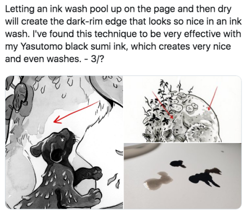
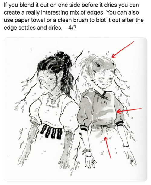
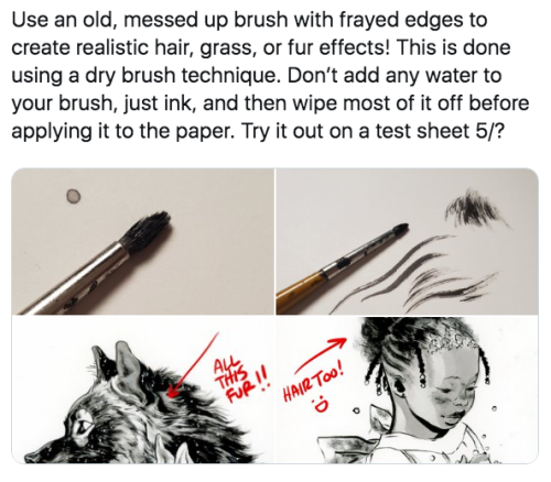
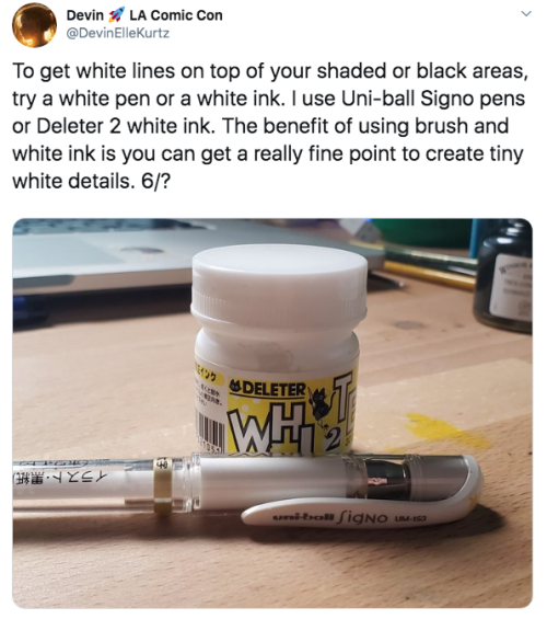
Latest Posts by dubiasdead - Page 2


´´We are in WAR Against a powerful enemy Relentless That does not respect anything or anyone Who is willing to use violence and crime without any limits. Even when it means the loss of human lives Who are willing to burn hospitals, subway stations and supermarkets With the sole purpose of producing as much damage as possible to all Chileans They are at WAR with all Chileans of good will that we want to live in democracy, with freedom and in peace.“
- President Sebastian Piñera; 21-10-19 -
NO ESTAMOS EN GUERRA
that our own president has declared such words against his own country denotes the disconnection of this government with his people.
WE DEMAND BASIC HUMAN RIGHTS, WE DEMAND DIGNIFY LIFE
WE DEMAND TO BE HEARD, WE DEMAND NO MORE LIES
summary of what’s happening in Chile

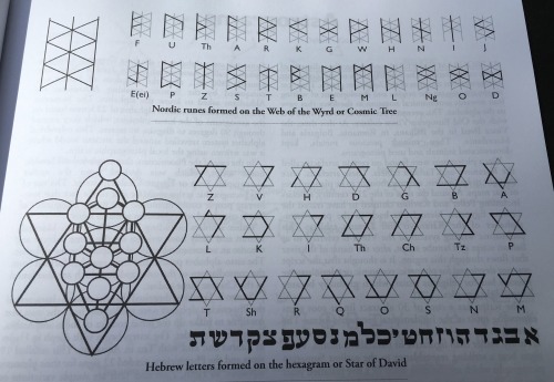
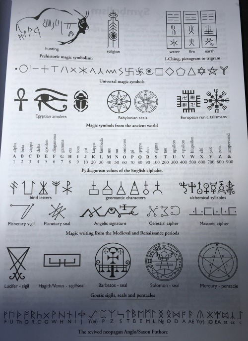


“Sigils, Ciphers and Scripts: History and Graphic Function of Magick Symbols” by M. B. Jackson (2013) - selected plates.
This book is highly recommended - it packs a very large amount of accurate information into its 64 pages.
“The world is language” - Terence McKenna.
At each level of experience there are various languages, codes and symbols that describe that level. The first step to improving your own state and that of others is to understand how these languages work. The next step is to start writing your own narratives, stories and texts in your language of choice.
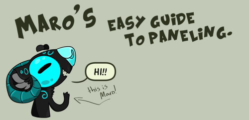
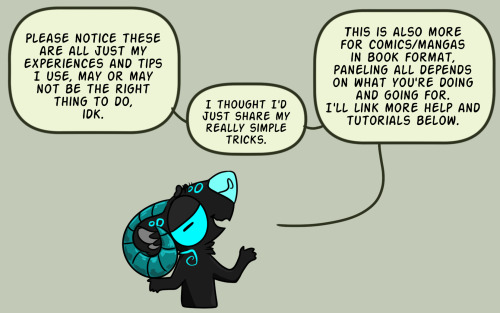
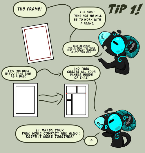
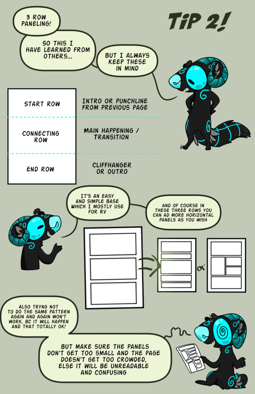
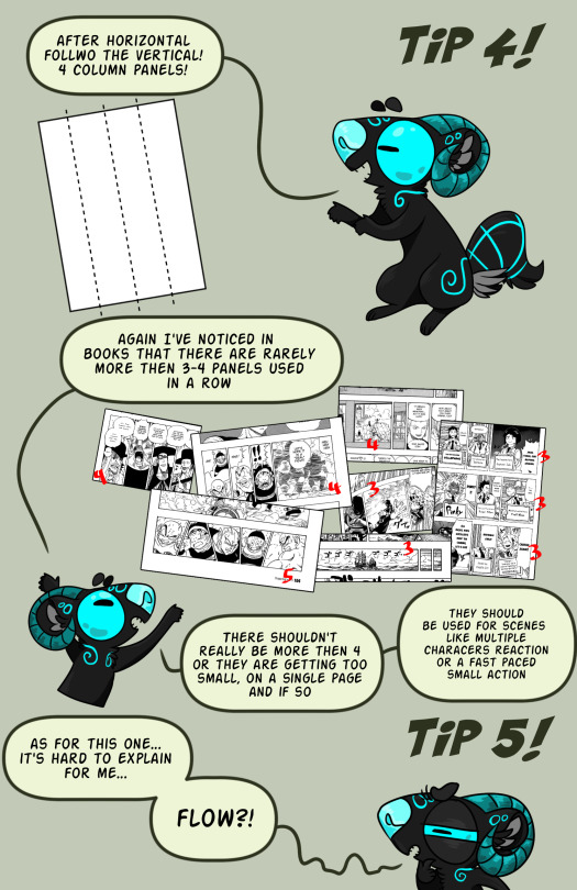
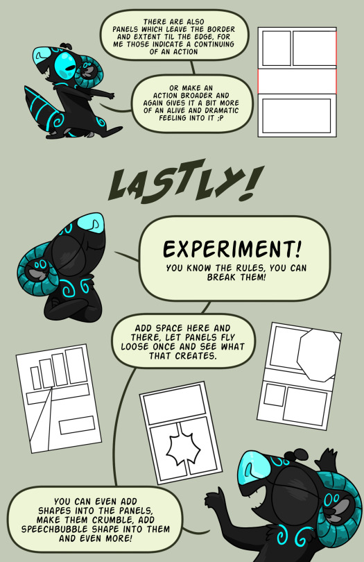
Some Comic Tips
Do character reference sheets. They will save you!!! So much time!!! From correcting stupid, random outfit/hair changes.
Add backgrounds. It’ll bring readers into the scene and add depth to your story’s world. Plus it’s good perspective practice!!!
Always factor in speech bubbles. They are part of the composition, they help the comic flow, so make sure you plan them into your pages early on.
Make characters look toward the next panel. That’s literally the easiest way to make your page flow. Readers will follow the character’s eyes.
Big panels are for the important things. Readers naturally focus on them for longer, so fill them with intricate details and important information. Like a dramatic reveal or smoochin’.
Amazing Nature Phenomenons
ᴋᴀᴡᴀʜ ɪᴊᴇɴ (ʙʟᴜᴇ ᴠᴏʟᴄᴀɴᴏ) ɪɴᴅᴏɴᴇsɪᴀ

ᴛᴜʀǫᴜᴏɪsᴇ ɪᴄᴇ: ʟᴀᴋᴇ ʙᴀɪᴋᴀʟ-ʀᴜssɪᴀ

sᴜᴘᴇʀᴄᴇʟʟ sᴛᴏʀᴍ

ɢʀᴇᴇɴ ғʟᴀsʜ sᴜɴsᴇᴛ

sɴᴏᴡ ᴄʜɪᴍɴᴇʏ: ᴍᴏᴜɴᴛ ᴇʀʙᴜs-ᴀɴᴛᴀʀᴛɪᴄᴀ

sᴋʏ ᴘᴜɴᴄʜ

sᴛʀɪᴘᴇᴅ ɪᴄᴇʙᴇʀɢs:ᴀɴᴛᴀʀᴛɪᴄᴀ

ʟɪɢʜᴛ ᴘɪʟʟᴀʀs

sᴀʟᴀʀ ᴅᴇ ᴜʏᴜɴɪ (ʀᴇғʟᴇᴄᴛɪɴɢ ᴅᴇsᴇʀᴛ) ʙᴏʟɪᴠɪᴀ

ᴍᴀᴇʟsᴛʀᴏᴍ

ᴇʏᴇ ᴏғ sᴀʜᴀʀᴀ:ᴍᴀᴜʀɪᴛᴀɴɪᴀ

ғɪʀᴇ ʀᴀɪɴʙᴏᴡ

ᴘᴏʀᴏʀᴏᴄᴀ (ɴᴇᴠᴇʀ ᴇɴᴅɪɴɢ ᴡᴀᴠᴇ) ᴀᴍᴀᴢᴏɴ ʀɪᴠᴇʀ-ʙʀᴀᴢɪʟ

ᴀᴜʀᴏʀᴀ ʙᴏʀᴇᴀʟɪs

ɢʀᴇᴀᴛ ʙʟᴜᴇ ʜᴏʟᴇ:ʙᴇʟɪᴢᴇ

ʀᴀɪɴʙᴏᴡ ᴇᴜᴄᴀʟʏᴘᴛᴜs ᴛʀᴇᴇs

sᴛᴏɴᴇ ғᴏʀᴇsᴛ:ᴍᴀᴅᴀɢᴀsᴄᴀʀ

ᴄᴀᴛᴀᴛᴜᴍʙᴏ ʟɪɢʜᴛɴɪɴɢ (ɴᴇᴠᴇʀᴇɴᴅɪɴɢ sᴛᴏʀᴍ) ᴠᴇɴᴇᴢᴜᴇʟᴀ

ᴍᴀᴍᴍᴀᴛᴜs ᴄʟᴏᴜᴅs

ᴡʜɪᴛᴇ ʀᴀɪɴʙᴏᴡ

ᴜɴᴅᴇʀᴡᴀᴛᴇʀ ᴄʀᴏᴘ ᴄɪʀᴄʟᴇs

ʙɪᴏʟᴜᴍɪɴᴇsᴄᴇɴᴛ ᴡᴀᴠᴇs

ᴍᴏʀɴɪɴɢ ɢʟᴏʀʏ ᴄʟᴏᴜᴅs

ᴠᴏʟᴄᴀɴɪᴄ ʟɪɢʜᴛɪɴɢ

ɴᴀᴄʀᴇᴏᴜs ᴄʟᴏᴜᴅs

ʀᴀɪɴʙᴏᴡ ᴍᴏᴜɴᴛᴀɪɴs:ᴄʜɪɴᴀ

ʟᴇɴᴛɪᴄᴜʟᴀʀ ᴄʟᴏᴜᴅ

Anyone have the gif’s of the Chilean goalkeeper Christiane Endler lifting two of her teammates with ease.
I need them for um reasons lol
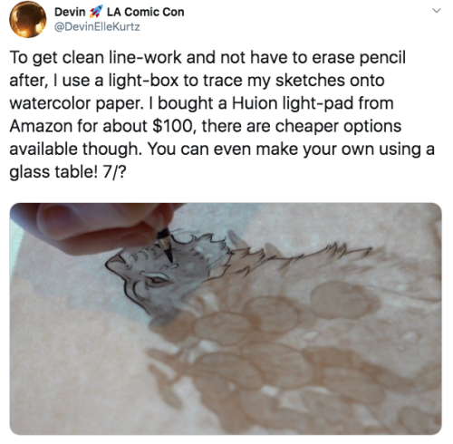
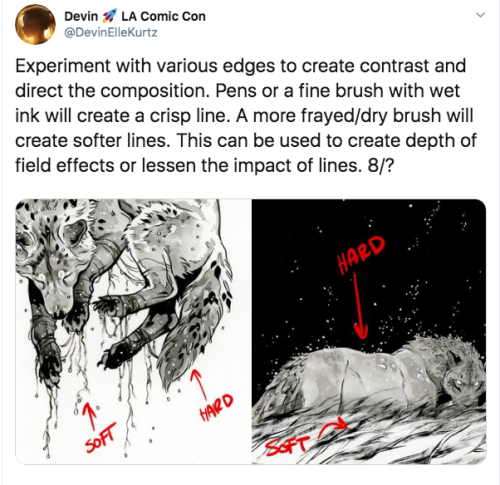
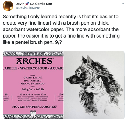
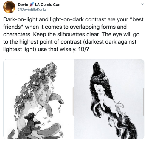


A Twitter thread of mine that I think some of you may find useful here as well! I’ll update this periodically when I update the Twitter thread.


He’s right ya know


LINKS(aka tutorials by ppl who make better tutorials):
Paneling 1
Paneling 2 (text heavy)
Crossing the 180°
Simple comic panel Tutorial
Guide to comic panels (+OTHER LINKS)
Comic strip artists kit
LETTERING
Webcomic Guide by Tapastic users!
Lettering by ZombieSmile
How I draw comics (also by ZombieSmile)
an ask about comics part 1
Start a webcomic?
A thing about perspective
If you dig yourself mor einto it, you’ll find more and more helpful things, even for a style you might want in your comics and whatever more! But I should probably stop the link spam here….
But if you have any more questions, ether you want to know form me or if I know a tutorial, go ahead and ask!!
(source)
LINKS(aka tutorials by ppl who make better tutorials):
Paneling 1
Paneling 2 (text heavy)
Crossing the 180°
Simple comic panel Tutorial
Guide to comic panels (+OTHER LINKS)
Comic strip artists kit
LETTERING
Webcomic Guide by Tapastic users!
Lettering by ZombieSmile
How I draw comics (also by ZombieSmile)
an ask about comics part 1
Start a webcomic?
A thing about perspective
If you dig yourself mor einto it, you’ll find more and more helpful things, even for a style you might want in your comics and whatever more! But I should probably stop the link spam here….
But if you have any more questions, ether you want to know form me or if I know a tutorial, go ahead and ask!!
PLEASE SHARE THIS!
Five Demands of the Hong Kong people:
Full withdrawal of the Extradition Bill (a.k.a. the Evil Law)
Retraction of the characterisation of the protest as a “riot”
Release of all the arrested protesters (especially the students and the wounded)
Accountability for police brutality
Resignation of Carrie Lam

The only way we can help

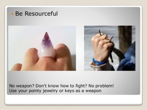
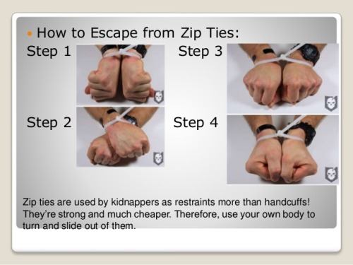


Step 1,2 3…. But, the best self defense is awareness.
The most popular feiyue shoes on: http://www.icnbuys.com/feiyue-shoes
follow back
How to help Amazônia:
You can donate to SOS Amazônia which is one among the 100 NGOs selected as “The Largest NGOs in Brazil”.
> > > ( ENGLISH: //doe.sosamazonia.org.br/en ) < < <

And remember: - 1 USD is 4,04 reais. - 1 EUR is 4,47 reais. If you donate only $2,50 USD (10 reais) you’re helping a lot.
If you donate only $2,30 EUR (10 reais) you’re helping a lot. About people saying “the minimum value is $10”: Even if you’re not from Brazil you can donate in REAL instead of donating in USD or EUR via Paypal, so… YES, you can donate less than 10 dollars or euros. (Just don’t change the currency to USD or EUR, Paypal converts your dollars/euros to reais.)

Please. Boost if possible, this is REALLY important.
Why is no one talking about what happened in São Paulo yesterday?
The sky turned completely black around three in the afternoon partly because of smoke coming from the Amazon rainforest, WHICH IS 2300 KILOMETERS AWAY FROM THE CITY, where the government has greatly increased the amount of land being burned for profit. People are getting sick, animals are dying, native territory is being lost to the flames.
This is what the sky looked like in my city yesterday, in the early afternoon.


It got so dark so fast the city had to turn on the lamp posts and night lighting.
Please talk about this. Reblog this post, non-brazilians especially.
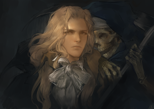
Castlevania painting(/v/ drawthread request)
#come through baba
being a self-taught artist with no formal training is having done art seriously since you were a young teenager and only finding out that you’re supposed to do warm up sketches every time you’re about to work on serious art when you’re fuckin twenty-five
Day 0
Vento Aureo has ended today.
Stone Ocean is not confirmed.


Since Toffee knows how it all turns out, he could have done this.
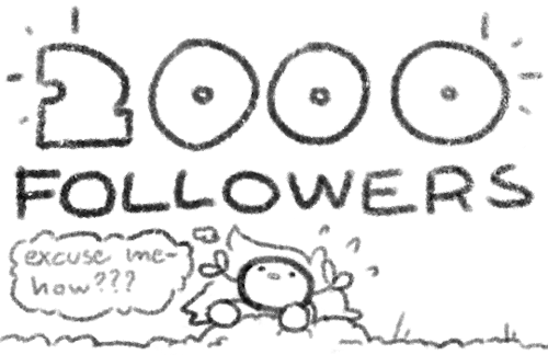
Wow so I just hit 2000 followers! I wanted to do something to celebrate, so I’m holding a *drumroll*

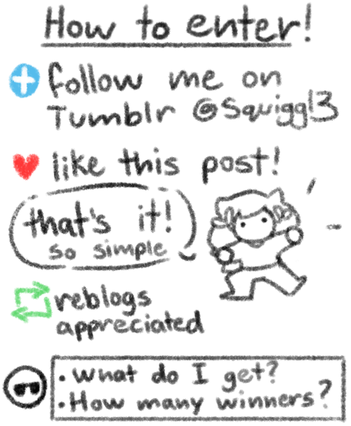
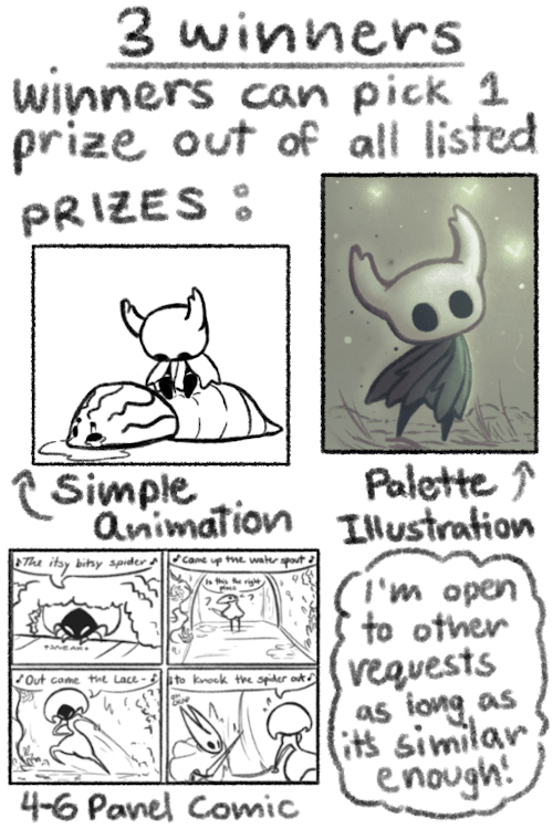

Thank y’all so much!! ;v; Text transcript under cut:
Keep reading


My friends, @knifeson and I did info pack of Hong Kong Extradition Bill Vol.2. Hope you will understand more on the situation here now. Thank you all for your kind attention.
Vol.1
Original Facebook page
Webcomic tips
In the conclusion for now, some things I’d really recommend doing if you’re seriously considering making a webcomic (or really a comic in general). Some of these don’t really apply to strips or gag-a-day type of comics, but I’m not talking about those here.
1. Write down ideas\sketch stuff, LEGIBLY. “I’m gonna remember it later” NEVER works. And if you scribble it somewhere on a piece of paper, you’d better scan it or retype in one doc later, because tiny notes always get lost among other doodles in my skethbooks.

(i know it’s hard to keep everything clean and organized, but this mess is just not productive)
If your project is a collaboration, save your conversations. If you’re working alone, make a blog for your ramblings. You have no clue what tears of relief I cry when I open that blog and rememeber I don’t have to painstakingly look through my heaps of sketchbooks and folders for a tiny idea I’m not even sure I wrote down a few months ago.
2. Inspiration folders, or even better, inspo blog with tags also help with collecting and remembering ideas. Color schemes, landscapes, style inspirations, atmospheric stuff, maybe some photo references, all those neat things.

3. Basic tier: character design sheets. Top tier: common poses, expressions. God tier: outfits they wear throughout the comic. Holy cow tier: turnaround sheets for all those outfits.

(I’d die trying to find good pages for references without these)
4. If you haven’t finished detailing the plot, don’t even think about moving on to drawing the comic. You’re gonna regret it when you come up with a really cool plot element that can’t be incorporated anymore because you’ve already drawn all the parts you could’ve tweaked.
5. Don’t just define the plot, make a script. Writing down the lines and the brief description of the actions serves me fine:

(notice that I approximately divided the pages & the text that’d go to each panel on a page)
6. Hard mode: make thumbnails for all the pages, if possible. At least whenever a new chapter starts.
7. If your story involves some convoluted chronology shenanigans, you’d better write down the events of your timeline in the chronological order.
8. Backgrounds. You can’t avoid them, bro. Like half of the comics are backgrounds, especially if your story involves a lot of adventuring and looking around. I know it hurts, but you’ll have to become friends with them. Read some tutorials, practice on photos, go out and sketch some streets, use 3d programs (like Google Sketch) to understand the perspective, use sites like houseplans to visualize your buildings better, I don’t know. Just be prepared for their imminent evil.
9. If you’re drawing digitally, pick a brush size for the lines and stick with it. You don’t want your lines and detail levels to look all wonky and inconsistent in different panels. And I don’t mean the cool stylistic varying lines, I mean this:

Also, things on the background should have thinner and/or lighter lines to avoid distraction. Usually less details too, unless you’re making a busy background with a simple foreground to help it pop out. Or wanna draw the attention to an object on the bg.

10. Readable fonts. Even if you chose to ignore people with poor sight or dyslexia, the majority of your readers aren’t gonna be excited about struggling to decypher this:

Also, as much as I love my black speech bubbles, colorful text on black still kinda hurts the eyes. I wouldn’t recommend doing that for all the characters. Black speech bubbles are usually used for creepy, inhuman voices. And yes, having a colorful outline in this case helps.
11. Probably newsflash, but did you know that panels have their place, order and functions? They do! My favourite thing ever is how I used panels when I was like 12:

(comics ain’t rocket science, but this one is)
The composition of the panels and word balloons always serve for a better reading experience. They guide your eyes over the page, so that you never feel lost or confused. The images in the comic equal frames in a movie, so it’s pretty damn important in what order you look at things and how quickly you can understand what’s going on!

(Eric Shanower & Scottie Young’s Wizard of Oz)
12. One update a week is fine for testing waters. Don’t overestimate yourself, especially if you have a pretty busy life outside it. A stable comic that updates slowly, but regularly is better than an unpredictable erratic one. You can always pick up the pace later, if you feel confident enough.
13. Try to always have a buffer - a couple of pages in reserve. If you’re making the pages much faster than you’re updating, this shouldn’t be a problem. But if those paces are equally the same, it’s goddamn HARD. But on the other hand, if something happens and you skip an update, those come in handy.
If you’re looking at this list and thinking “wow that’s a LOT of work”, you’re totally right. And it’s okay to be intimidated at first! But that’s why it’s important to start with something small. Once you get the formula down, these things will be natural to you.
ways to start feeling again
sit in the sun without anything to do, feel the heat of the rays hit your skin, realize that this sunlight has travelled a very long way to reach you
walk around barefoot and try to feel as much of the ground under your feet as you can, notice every rock and blade of grass
sit quietly for a while and notice the touch of breath in your nostrils, feel how the air gets cooler as you inhale and warmer as you exhale
drive around aimlessly and blast some of your favorite songs, scream/sing along to them and feel the vibrations of your favorite lyrics as they change the air in your throat and around you, feel that the music is healing you from the inside out
stay away from alcohol or drugs for a few days, try to be as aware and present as you can in every moment, stop trying to numb or dull your senses
eat a few meals without any distractions, notice every bite and taste every flavor that covers your tongue, be grateful for it all
look up at the stars and the moon, understand how small we all are and how immense the universe is, realize what a miracle everything is, let your heart swell with amazement and admiration for life itself
Lyric video tribute to @modmad‘s webcomic The Property of Hate


Do you like Mario RPGs? Paper Mario? Do you like stories about the power of friendship? If so, have I got something for you!
I made a huge set of color keys based off the game Super Mario RPG: Legend of the Seven Stars, a game that I’ve really loved since I was a teen. This is a super self indulgent project that is very much an interpretation from the heart, so I hope you enjoy it as much as I do!
Below is a link to where you can download (click the download icon in the top right corner of the google page!) and read it! Thank you!
https://drive.google.com/open?id=14gbceNpdkB380knvofHFhnfRqSlS8xUl
(If the PDF quality is fuzzy, just zoom out once, and back in again to make it load!)
random thing but i realized it might be helpful for some people so uh. theres this thingy where you can upload an image and it gives you a color palette based on it !
heres an example

and it also gives you the hex code values for them too its p neat !
here’s the link to the website !
What ARE Vanishing Points?
So I feel like a lot of confusion with drawing in perspective is because people are not taught the absolute basics properly? So let’s do that.
Let’s say we have a cube.
Now, a cube we know is made out of 6 squares or rectangles, and every edge is at a 90 degree angle.
so every opposite edge of a cube is exactly parallel, right?
but let’s say we draw a cube using only parallel lines:

this looks a little weird, you know? Like if i try think of this as an object in 3d space and i look at it for too long, the faces start to look really warped - with like the back looking bigger than the front as if its been made out of weird wonky trapeziums

so what’s going on here? if all those edges are exactly parallel, why does it look weird?
lets take a look at this photo of a railway track

Now we know that the rails on a track are always going to be parallel, they have to be the same distance apart so the train can stay on the track yeah?
But we can very clearly see that these tracks are converging to a single point in the photo.
So what does this tell us, exactly? That our view of the world is naturally warped, and that lines that are physically parallel when drawn in perspective will converge to a single point.
Now, I could call this image “one point perspective” - but that’s not really true,

if these lines are also parallel, then they must also converge to a single point in perspective, right? so lets add another point

clip studio paint automatically adjusts the horizon line to fit the new points you add to your perspective…. notice how the horizon line actually fits the photo better now?

our new point is a very very long way away, so we don’t notice a lot of difference in the angle between lines, but the point that i’m trying to make here is:
Drawing with perspective guides is not about choosing one, two, three point perspective etc. those are just quick ways to set up a certain viewing angle
What you are doing when you use these guides is making your parallel lines converge to a point.
So, if you want to draw a big ol’ cube that’s aligned to be parallel with these railroad tracks, then you can do that with the same point as the tracks - because it’s parallel. It’s on the same axis!

but what if you want to draw a cube that’s rotated, and isn’t parallel to the tracks?
well that’s not too difficult to do if you know that every point represents one set of parallel lines.
If these lines aren’t parallel to the ones you already have, then clearly you just need new points.
We’re not planning to tilt this cube up into the air, or rotate it onto its side, so we’re going to leave the vertical axis alone, and just move our horizontal points to a different place on the horizon line

But speaking of the vertical axis - the only points that will be on your horizon line are the ones that are flat on the ground. But you can still have points that are not on the horizon line!

This is important to remember because if you’re trying to draw something like a slope or stairs, something that has an incline, it’s not going to be level with your horizon.
Let’s draw some stairs as an example.

This is actually pretty simple - first draw where your slope starts and ends by drawing a big L shape.
this will give you some parallel corners, which you can then connect to make a new point for your slope

And with this you can then find the centre and divide that up into equal parts to make your stairs (http://lesbianlinkle.tumblr.com/post/176704472820)


So lets go back to our original cube, with the knowledge that our parallel lines should all converge to a point and draw it again

well, doesn’t that look better!
but also, now you know how to make a cube lean against its buddy like this

because we just make new points for the new parallel lines

Anyway I hope that clears some things up, and makes perspective easier to understand!
Also if these tutorials have been helpful and you’d like to support me, I do have a patreon & a ko-fi you can donate to :^)