Latest Posts by dubiasdead - Page 3
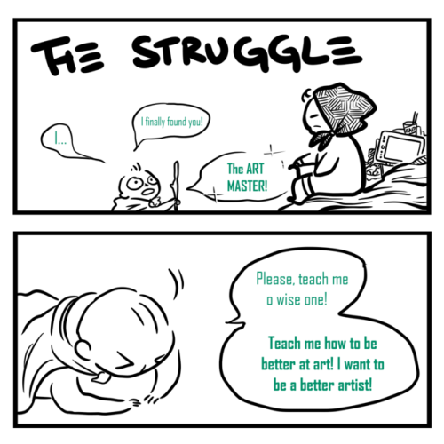
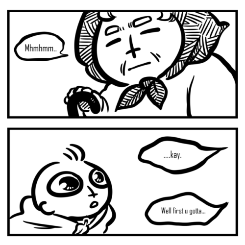
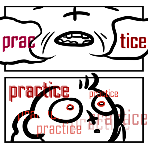
art tips post
for all the artist following me
Have two sketchbooks: One for finished and high-quality art (stuff made with Prismacolor or Copic if you use that or art for your portfolio) and the other sketchbook for more messy doodles. This way you have a place to try new things and mess up as much as you need. When I only had one sketchbook I was scared to draw in it because I didn't want to mess it up
Do studies. I cant tell you how much I've improved just by doing studies of shoes, hands, noses, and all that. This works for when you have art block too since you’re not really making stuff up and just learning how real things work.
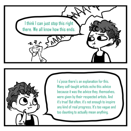
Learn from others. I’ve never taken a real art class because 1. I can’t afford it and 2. there’s no good art classes/programs at my school. I’ve been following several artists and learning from them over the years and they’ve helped me tremendously. Just please do not steal art because that is never okay.
Break down concepts. If you notice there’s something wrong with your piece then figure out why. You can’t get better if you leave mistakes and don't try to understand whats going on. If the color is weird figure out if the values look right or maybe its the saturation of the color.
Watch youtube tutorials. Here are some youtubers I think are pretty good art teaching all things art: Draw with Jazza | DrawingWiffWaffles | Proko | Baylee Jae
Have an inspiration folder/blog. Sometimes you just need a collection of starry nights or a misty forest or even a French bakery. All of those things can help you get inspired to draw. It could even be completely unrelated to what you plan to draw.
There are no dumb ideas in the creative process. If you want to draw a lizard in a dress go for it! If you want to draw various pastries with faces do it! Don’t let the thought of it being too dumb stop you because if I’ve learned anything in my several years of drawing it’s that an idea can lead to another and another and another and you may get a really good idea just from doodling dumb things.
Here’s a few things that can get you started on drawing better:
Dynamic poses | Dynamic clothes | Dynamic figure drawing
COMPOSITION | PERSPECTIVE | CONSTRUCTION
Anatomy:
Legs
Arms
Hands
Heads
Body (Female) (Male
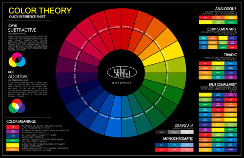
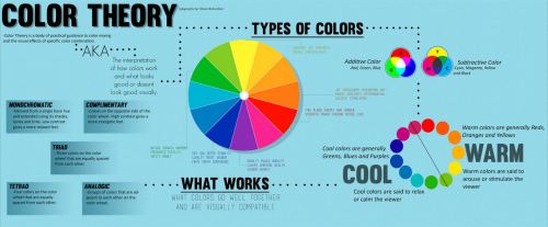
Color Theory
Improving your sketchbook
Most importantly, don’t give up! You may not immediately get notes or followers but it’s more important you get better than to have popularity. How do you think those popular artists got to where they are now? To be good you’ve got to work at it.
rb if you’re not afraid to have a picture of God in your timeline

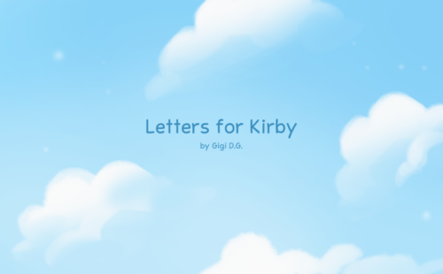
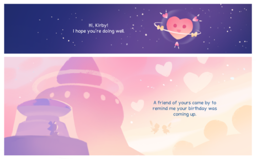
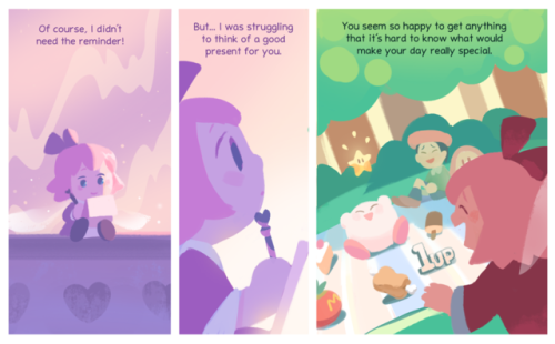
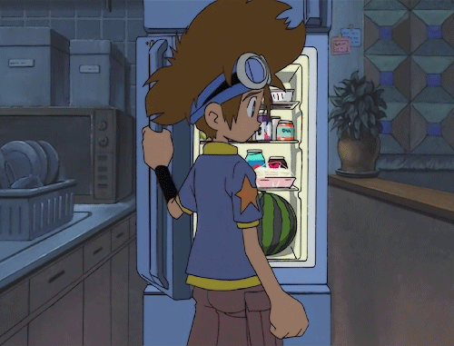
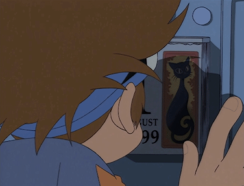
i made a short comic about kirby for the series’ 25th anniversary! please read the rest on my twitter or my website.


This originally was going to be for Patreon but I decided to share it for free.
Basic realistic canine hind leg tutorial. Please note that some dogs do have dew claws on their hind legs, but not most.
Basic Gesture and Body construction tutorial.
I made this tutorial for a friend who needed some advice but if it helps anyone else, free free to use!


This is for basic body construction, try it from life drawing or from a website that have these life drawing poses! Remember, don’t rush the process and don’t feel frustrated when it isn’t perfect, it takes lots of practice!


basic structure of human body
got my tutorial books and comics here
Would you ever do a simple tutorial of how you draw horses? I want to make centaur OCs but lord horses are difficult creatures to doodle 😭
Mmmm there are so many guides that cover what I do, and I reallydon’t do anything more than those. Still use the whole blocks and sticks andform building and whatnot. And a buttload of references. Anything I could say different would kinda step beyond the stage of simplicity?
To offer something though I would like, suggest tweaking the use of circles whenit comes to drawing horses. Or anything, really. Circles are great and highly accessible for fast, generaldrawing, but few natural things are perfectly round. Look at a horse from thefront or back - it’s square and flat and meaty and saggy too, depending on yourangle.
So like, I dunno, if you wanna step it up a notch, trychanging your use of building-circles into something like this

And especially practice being able to see these shapes indimension


And then piece them together. The triangle will really help guide the line up. Highly recommend.

Honestly I just follow the same gist of Hubedihubbe’s quicktut (please check it out, very good points made, much cleaner, actually labelled) so I kind of feel like I’m parroting here but.. I break down the rest inlines and diamonds.

As a personal preference, I like marking in the shoulderblade to elbow and the hip to knee, as they create pretty important shapes towardshorse recognition. If something keeps looking off, check your leg length. A super rough way to get a close idea of what you need can be found in using most of the shoulder block for a landmark? It’s not perfect maths, it’s a rough tell. The hind legs are then worked out via the red line, setting the hocks above the intersection across the knees

And uh, it goes on from there. You gotta look at pictures, dothe study, and learn the meats. No real other way around that part.

There’s a horse bod.
But the reason of learning how to see those shapes indimension is so that you can push your poses further! Try piecing it together with your front-view knowledge. Andlook at references, always!

Shoulders are pretty narrow compared to the belly and hindquarters, unless you start looking into the draft breeds - then both ends more or less square up together. But moving on, more leggies are slapped on that thing

And fleshed out with all that meat knowledge :P (I know I haven’t gone into heads but this was about centaurs anyway. This guy just felt like he needed one)

And when it comes to practiceand learning, don’t be afraid to simply drawthese shapes directly over an image. It will help familiarise you with howthese base forms interact with one another, how far they can squash and stretchand look at a whole variety of angles. It’s just practice!

Doing that helps to gain asolid concept of the subject, so that when you do set out on your own you canfind that convincing territory.
So hey, this has been a very long and terrible not-tutorial. More like insight or something, and would only be helpful if you’re somewhat familiar with horses and already got the fundamentals of drawing down pat, since I skipped over a lot.
Haven’t drawn a horse before though? I recommend you the Shrimp method
Anyway, hope all this was kinda interesting


Hips Tutorial by bokuman
Support the artist on Patreon!


after that you can just merge everything or dont (i didnt merge it) and then you would get:

some stuff to mention:
ty for the compliment i appreciate it <33
sorry if my handwriting is hard to read xd
along the making of this tutorial thing i had no idea where this was going, so i just decided to do a tutorial on how i did certain details of water and shit
there were multiple different things i did for drawing water while i made the comic so it seemed more appropriate to just do a tutorial(?)/explanation on what i did and how i did it
some of this information may not be accurate since im not a pro at art or anything i just learn from what i see
some parts mostly consisted of trial and error since water is a pain in the ass (dont be afraid of that)
there are other people who could have given a better tutorial and process than me, and this is just what i know, so maybe this helped you and others in some way, who knows ¯\_(ツ)_/¯


Walk, Trot, and Gallop:
Top Row: Eadwaerd Muybridge
Row 2, by Richard Williams
Row 3, by Preston Blair
Row 4, by Marc Davis
Row 5, by Josh Weldake
Row 6, 7, & 8


Here’s a project I’ve been working on for a bit! I wanted to do mock color keys, so I decided to take something pre-existing and make scene keys for it, which ended up being kirby 64! Kirby is simple, so he makes for a good canvas to use different schemes and lighting. I totally recommend doing color keys of a game or movie; I really learned a lot about decision making from doing this!
2d Animation - Smearing
What is smearing? Smearing is a multitude of techniques used in animation to bridge two or more frames to create the illusion of motion through methods like blurring, warping, distortion, and a few others.
I wanted to start of with a fresh animation to demonstrate some movements.

It looks like it can definitely use some extra information to convey the motion of the sword. This is where we starting thinking about how to smear the object(s).
The most common approach that I’ve noticed that animators take, especially newer animators, is that they warp the whole object. As in they have a point A, and a point B, and then they just have a “mass” of implied motion in between those points.

Here’s a still shot

It works quite well with objects like swords. So here’s what my attempt looked like.

It definitely helped explain the movements more, but I’m not sure I liked it.
Thankfully there are other “types” of smears that we can look at to try to see if they fit in this particular animation.
The next one I wanted to try was “speedlining.” This is basically when you distort the edges or add speedlines to the edges to make the object appear in motion.
Here’s an example

and the still shot:

notices how the edges appear more sketchy. This one is really common and it can be executed in different ways.
Here’s my attempt

I really like this type of smearing, even though it still lacks some of the motion that the first iteration lacked. The speedlines really add character to the motion that would otherwise be missing in a normal warp, but I still needed that smear to bring it to the point where it needed to be.
So here’s what some call “doubling.” (and just as a side comment, I don’t think any of these have “official names” other than just smearing)

Here’s the still shot

This was a really well executed smear which I don’t think would have worked the same if you would have just warped the faces.
Here’s another slightly different execution

with the still shot

It’s like a distortion mixed with doubling, and that’s what I like about smears.. you can mix and match things you feel would work in the particular scene.
So here’s my mix n’ match smear.

Not the best execution, but for our purposes I think it works well.
Motion blurring is really powerful as well. Film uses it all the time, as does 2d animation. Notice the force of the impact being pronounced with the added blur at the head.

Here’s the still shot

There are a few other smears I thought were interesting because it just speaks to the way our brain interprets these frames without even considering the logical implications of the individual frames.
Here’s one example

I don’t know if you caught that, but here is the still shot:

The guy has a knob for a hand. It works so well, you don’t stop to think about implication of that hand’s morphology.
Here’s another one that doesn’t make too much sense.

Like what is this

That’s Imaishi. It’s part of why we love that animator so much. It’s part of his style and character. It conveys an emotion that would otherwise be absent in a “realistic” smear. Animation doesn’t have to make sense. It just has to look good.

I drew a quick chart about good wrist and finger exercise before playing Splatoon (or engaging in any other intense activity such as but not limited to gaming in general, programming, drawing, computer work etc.) As with all stretching exercise, these should only be done in moderate speed. You only want to loosen up, not break your hands!! … and it kinda exploded on twitter haha
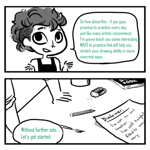

I made a thing! I was thinking about this for a few days - because I realized that when I was young, I was also frustrated about being given the same advice over and over - without really knowing what it meant!!
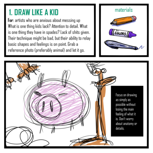
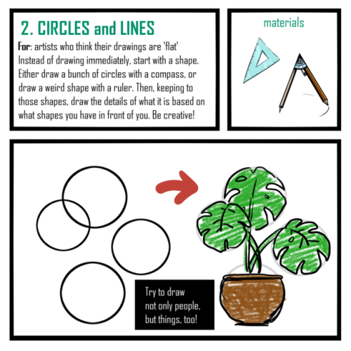
Here’s 5 techniques which I have done before which have helped me grow as an artist, which are good for 5-minute warmups or just straight up challenges for your sketchbook!
Obviously, these are not the ONLY techniques - they’re just the ones I find most fun! And maybe they’re not the most ‘correct’ ones out there, but it’s better than another comic about practicing more, right?
Good luck to everyone on their drawings!
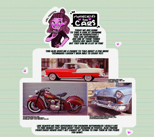
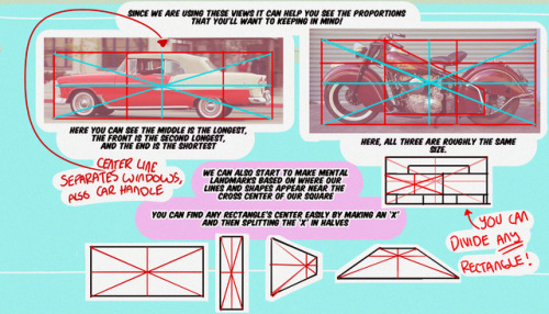


Hello, friends!
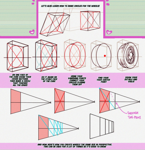
It’s Meg for this week’s TUTOR TUESDAY! Today we look at cars! if you have any recommendations send em in here or my personal. Keep practicing, have fun, and I’ll see you next week!
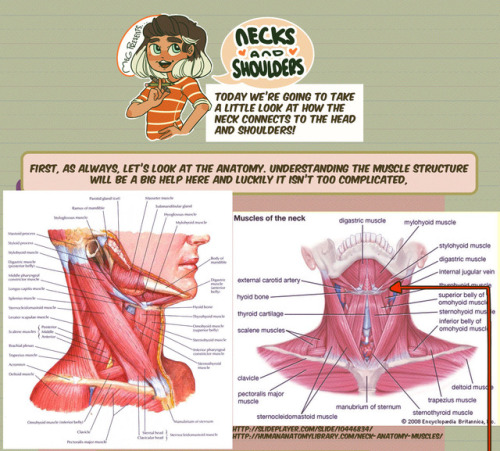
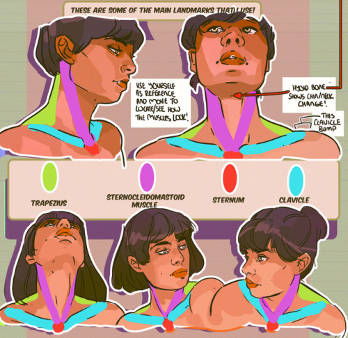
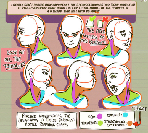
Hey friends! Meg here for TUTOR TUESDAY! Today we take a look at the neck and how it connects to the head and shoulders! Thanks for your patience! If you have any tutorial recs send ‘em in here or my personal. Now go forth and I’ll see you next week!


Masters of Anatomy

Fargo’s Equine Leg Tutorial by Fargonon

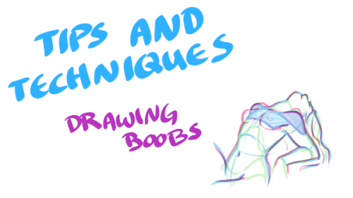
Just when you thought you knew everything about boobs… NSFW?


My darling friend Chizzi mentioned that there are a lot of booby tutorials out there are just predrawn boobs with the artist going HEY LOOK! HERE ARE SOME BOOBS! but not many that actually talk about the anatomical structure, and where to put the lines. I was like, “Hey, I can probably whip something up.“ And so I spent my thanksgiving making this.
Proportions probably aren’t exact, but I did my best. I also didn’t explore the various body types, but perhaps I could do a separate tutorial someday. I hope you find this tutorial useful :)
All photo references used in the tutorial were found on The Drawing Script. Credits to each photo belong to their respective owners.

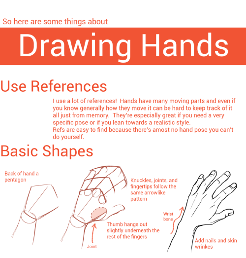
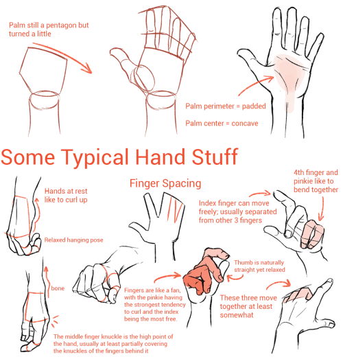


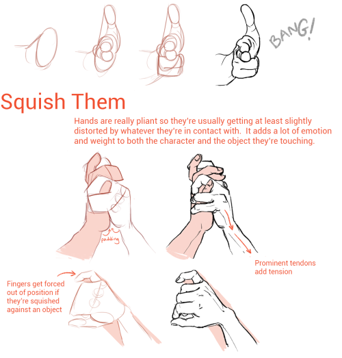
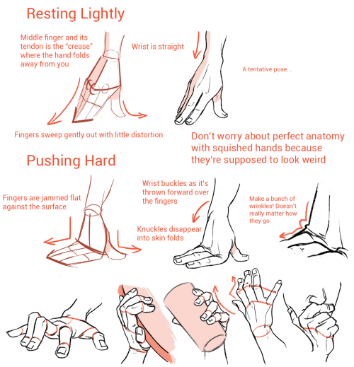

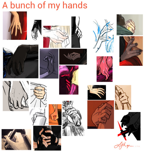
I’m not an expert but I like hands a lot so hopefully some of this was helpful!

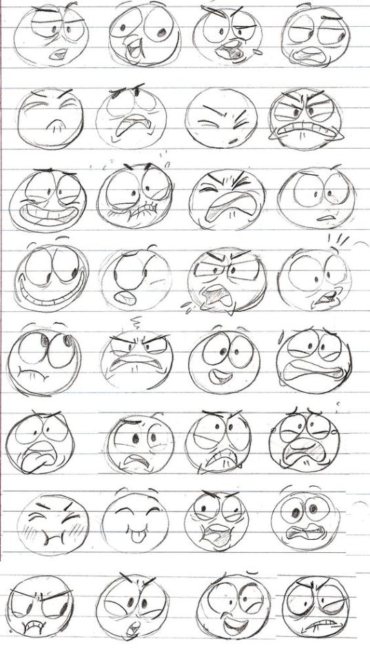
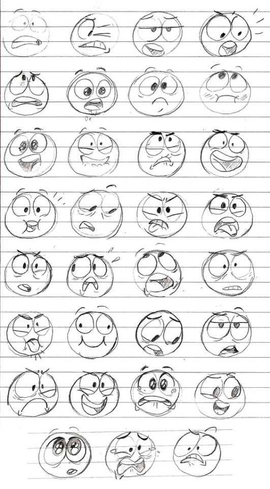
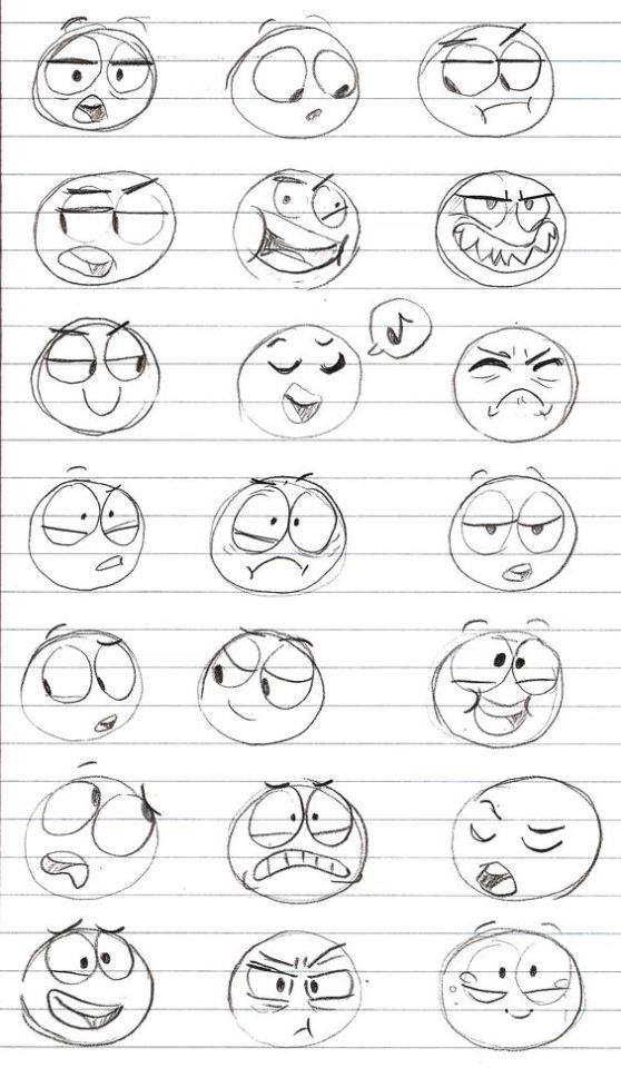
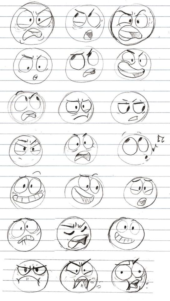


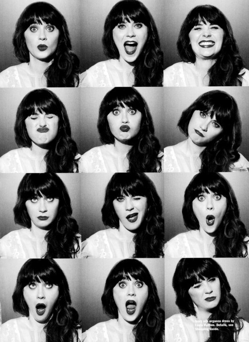

Facial Expressions Top Image Row 2 & 3 Row 4 Row 5: Left, Middle, Right Bottom Image (Source Unknown)

reblog to bless a dashboard


SO YOU WANNA DRAW CATS AND DOGS BUT THOSE PESKY SNOOTS GET IN THE WAY
Here’s a hopefully helpful tutorial on how to draw them from memory but it also helps to understand and break down how to see their structure when you use reference!
Remember, it’s always best to learn the anatomy of an animal first before trying to stylize it. This way you know the rules and can choose which ones to break!

Please do not repost this tutorial or any images from it. Permission will not be granted. You may post a link to this post instead to help spread it from the original source.


It seems like all of the resources I can easily find online for identifying wolves vs dogs are either massive and difficult to understand without prior knowledge of the subject, or extremely bare-bones and miss a lot of key information. I tried to hit a comfortable middle-ground. (sorry if it’s a little wordy) This tutorial is made as a reference for drawing, so everything but purely visual differences between dogs and wolves have been left out. I’ve been wanting to make this for a while now, so I’m glad I finally sat down and did it! **EDIT** When it comes to the section on wolfdogs, please take it with a grain of salt. With something as complicated as genetics, they are of course, not going to be as simple as I make it seem. What features different levels of content can display, and even which percentages designate which levels of content are often hotly debated within the wolfdog community. At this point I’ve elected not to change the image set itself because: a. it’s a huge pain in the ass b. this is a tutorial for beginning artists. It’s meant to be a hugely simplified version of the topic, and I’ve stated clearly that it is NOT to be used in real-world identification. **EDIT 2** A couple people have noted that the puppies section is a little misleading. Wolf puppies will always be born a solid brown, but that brown can range from a very dark brown (appearing as black) to a llight, gray-ish brown. The important point is that wolf pups will always be a solid color with even less distinguishable markings than even adult wolves. (also this guide does not include color possibilities related to birth defects or other genetic anomalies such as albinism) ((Huge thanks to yourdogisnotawolf. who’s blog inspired me to make this and for digging up that amazing picture of the wolf/lab mix))

Yes! Let them know ✊🏾