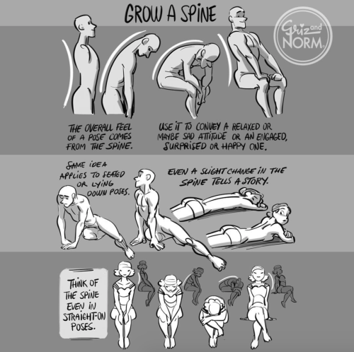
Your gateway to endless inspiration
Art Ref - Blog Posts
i love love love the way you paint back lighting!! do you have any tips/ a step by step for the way you do it?
ended up making a whole painting just to break it down and explain my general process for subjects lit from behind so heres that + a timelapse!

main thing for drawing anything with a strong light source behind is to make the main subject Darker and more desaturated to convey that the light is behind them rather than to their sides (face cant be properly lit if the light is behind). Also making the Main highlight the brightest hue in the image helps to intensify it. I tend to use teeth/eyes as a good comparison point

some people have a tendency to make the sclera white out of habit but darkening that+ the rest of the whites helps the image read as Darker compared to the brighter highlight
I feel stupid for asking this so im using anon, but how do you draw the hijab? Whenever I try it looks like an egg www
also, Ramadan Mubarak! May Allah bless you
Don’t feel stupid for asking! Drawing is hard no matter what you’re drawing, so don’t be afraid to ask for help^^ But honestly even I feel like the best of my hijabis look a little egg-like, and that’s okay!


This tutorial is already taking so goddamn long, so I’m just gonna link my coloring and shading tutorial I did a month ago 😭😭

Gosh, I hope what I wrote made sense 😅 But thank you so much for the well wishes! Happy Ramadan (Eid Mubarak at this point WAHHH), and the same to you, may you and your loved ones have many blessings!!
ADDITIONAL REFERENCES
Winchester Meg's Hijab Drawing Tutorial
Souratgar's Hijab Drawing Tutorial
General Tips for Drawing and Shading Fabrics
![[ Download Link ]](https://64.media.tumblr.com/5f429d178bb1fe4870a8c6931415c38e/1c195b3b919b6bc0-22/s500x750/9f3e89788ae15eab900a39fc63f99bd7a543868d.jpg)
![[ Download Link ]](https://64.media.tumblr.com/6dd33d9a47c84fae4004c3891a069032/1c195b3b919b6bc0-70/s500x750/7a350518ca98cd34cd6e5fa9cd463fb933dbcf11.jpg)
![[ Download Link ]](https://64.media.tumblr.com/c6bcee52d8e78ba0e31e786b91f81fc1/1c195b3b919b6bc0-03/s500x750/735d52cfd62421cf43e46a8a710f76dad2c52707.jpg)
![[ Download Link ]](https://64.media.tumblr.com/87c3f0ff1da8e8a917485898808bd63b/1c195b3b919b6bc0-64/s500x750/62e90c66492ac189a3325bbd25965dd635cc65b7.jpg)
![[ Download Link ]](https://64.media.tumblr.com/133564050990bca016611a68fa71a2de/1c195b3b919b6bc0-c1/s500x750/87ea85696f416c49b91f8f64754306f4208b6726.jpg)
![[ Download Link ]](https://64.media.tumblr.com/9a2582c5d3abc3f5cf6ce4587482f493/1c195b3b919b6bc0-c5/s500x750/19c8f03ee111f028acd365ae95b24a04a72e60d9.png)
[ Download Link ]
As promised, it’s finally here! Thank you to all of my patrons for not only the support that made this possible, but for giving me the confidence to work on a big project like this.
Rather than providing any drawing instruction, what this writeup aims to do is help you learn to unpack the decisions being made in a given composition, and articulate what elements in a piece are responsible for its impact. Being able to isolate these qualities in your own art and art that inspires you opens up avenues for improvement regardless of medium, style, or technical skill. This is the first of hopefully many PWYW art ‘tutorials’ from me.
I hope you all enjoy!


How to Transformer: Part 2
Vehicle Art Tutorial
Featuring @littleyarngoblin's car; Carwen 🚙
Flyer Art Tutorial coming soon!
Ko-fi


HOW TO TRANSFORMER: Part 1
Trust me, I'm a professional designer :)
Artist, please feel free to add your favorite details that I missed. I'm working on an illustrated/art tutorial version.
PART 2 UP NOW!!


How to draw Black characters. Because it's way too obvious when you drew a white person and gave them Black skin.
https://www.tiktok.com/t/ZTRg6YsKN/
-fae

"and the centry owl stood guard, protector of all in need." TFE, S1E13
Love love love Nightshade's new form 🦉
I compiled a reference for all my artist homies, and myself~
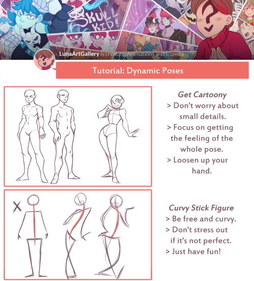
Art Tutorial Preview
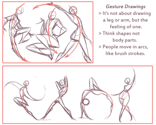
This one was a short weekly tutorial briefly talking about gesture drawing, shapes and how to reference. Next week I’ll do a reference sheet with dynamic poses, I didn’t get to it this week cause I ran out of time. Anyways I hoped this helped some people!
Yo! Get full access to all my tutorials/references through: Patreon: [https://www.patreon.com/lunaartgallery] or Paypal Order: the 10$ package will get you 15 items of anything available on my Patreon, emailed directly to you.
Thank you~!
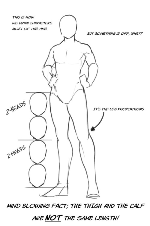
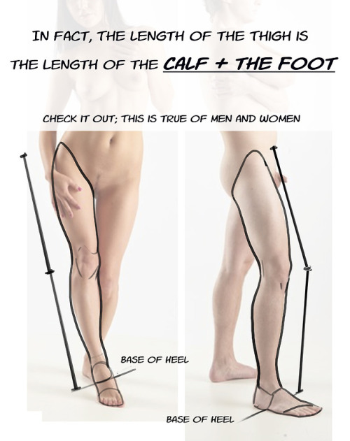
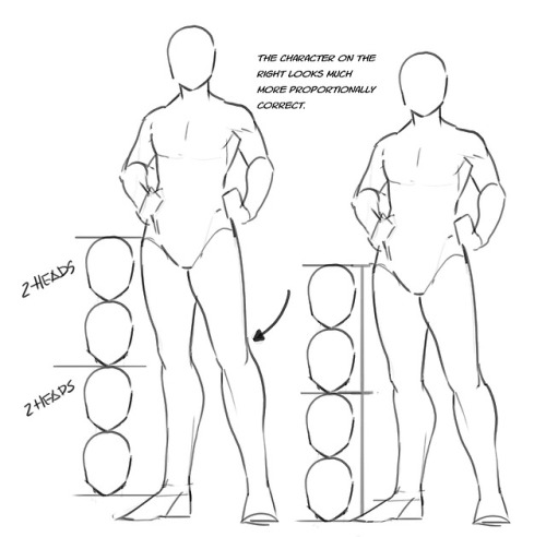
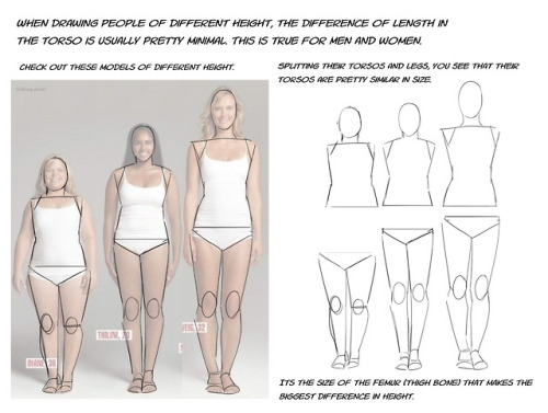
Just a quick thing I put together. This blew my fucking MIND when my anatomy teacher pointed it out. My drawings instantly got better. You might know it (good for you, I wish I knew it before too T_T) or you might not and it might help you get better.
I forgot I have to be active here so here’s my Twitter tutorial on how to draw folds I made a while back to help a friend!


U use colors in such a enrichening way, how do you do that may I ask??
thank you so much! 💕
this answer is going to be a little long.
the first thing, i think, is that it's very common to think of color as a means to an end, as just another type of information about a drawing: i'm using brown on the hair to show that the hair is brown, i'm using green to show that the characters are standing in grass.
but if color is information, then we can use it to say a lot more than just the basic facts of a drawing!
if you love drawing but want to get better with color, you have to learn to love color, too.
to want to know everything about how color works, to explore what different colors mean to you, to try and try and try again.
because, and this is the kicker:
ALL COLORS ARE RELATED TO EACH OTHER!

[from this post about how to use a color wheel]
i think it's common for people to talk about complementary colors and that's helpful when you're starting out with coloring, but i feel that it can become very limiting when it's treated like a rule and can obscure the fact that all colors are related to each other. it's called a color wheel because there is no beginning or end!

for example, take this drawing:

in this drawing, i'm using colors from all over:

but by just rearranging them slightly and throwing them against a black background like in the drawing, you can see how they're actually relating to each other and not nearly as random as they may seem at first glance!

[these notes are from this post where i break down how muted or "ugly" colors pull an image together] all colors are related to each other in some way, and that means that
YOU MUST DETERMINE WHAT EACH COLOR MEANS TO YOU, AND IT IS YOUR RESPONSIBILITY TO CONVEY THAT MEANING TO YOUR AUDIENCE.


for example, to me green can be uncomfortable and overwhelming, energetic and edgy, calm and natural, or fearful and tense. but no matter how it makes me feel, it's my responsibility to convey my relationship to green to whoever even glances at my drawing.
sure you can use commonly held ideas about colors [red = angry, blue = sad], but this shorthand is also limiting. if everyone used these commonly held ideas about color, there would be no room for experimentation or interesting, wild color choices! and colors mean different things to everyone-- that's what makes everyone's colorful art so different and so cool!!
another thing to note about those green drawings: each one is using a specific type of green.
the one with reigen leans blue-green, which creates a cool-colored image. meanwhile, reigen is warmer tones, which almost makes it seem like he's overheating when he's thrown against such a cool-toned background, which further expresses his discomfort!
the dimple!mob drawing is like a sprite or mountain dew-green, which encourages the feeling of electricity or energy. it's a cool yellowish-green.
the one of mob floating is a warmer yellowish-green, to suggest sunny warmth without drawing sun rays.
the divine tree arc drawing is a lot of reddish-greens, which can suggest a sickliness.
experiment with color combinations and different shades and hues! explore what these different types of colors mean to you!
so now let's get into the nitty gritty of color choice. the following images are from my free pdf about color, composition, and intuitive drawing:


the main takeaways from these pages are:
consider simplifying your colors! more colors does not necessarily equal a better drawing.
see how much a single color can do! can you use it in multiple places on your drawing? what meaning can you ascribe to the colors you're using?
consider creating a concept for your colors and a few rules to guide your piece! a lot of great drawings can fall apart because the coloring concept was too vague or because there weren't enough rules or guidelines to keep the image coherent.
are your colors saturated enough? are the different colors you're using fighting for the viewer's attention? do you have focal points in your art, and if so, are the colors you're using reinforcing those focal points?
use the tools at your disposal! color-picking, color balance, overlay layers. it can feel important to try to prove something by hand-picking every color, but even when i hand-pick my colors i almost always check them with color balance anyway to make sure i'm picking the best colors possible.
YOU DO NOT HAVE TO SUFFER FOR ART. PLEASE use everything that is available to you, and make sure that you are aligned with what brings you joy when you're making art!
i wanted to show an example of a drawing i've done that is doing way too much vs a drawing that is simpler but more balanced:


on the left, the colors are interesting but the background is too strong and is competing with the actual drawing for attention. on the right, the clear background and simple coloring create a cute, easy to read, successful image! this is what i mean when i say that colors can fight for the viewer's attention and mess up a good drawing.
my final secret is that i rarely shade with or use white, black, or grays. i don't think this is a rule that you have to follow, but i like it because it pushes me to figure out what colors will go best with each other, and i think this single tip has strengthened my understanding of color immensely. however, there are a lot of beautiful art styles that shade with and use pure white, black, and gray. you have to decide what you love!
and
STUDY!!!
look at other people's art, color pick it, and make a palette based on their art! look at how they represent values through color, how they shade, etc. study your favorite artists' work!! you will learn so much!!
i hope this was helpful! if you have any more follow-up questions or if there's something that you want to know that i didn't explain here, please don't hesitate to ask!


A master post of Thomas Romain’s art tutorials.
There’s not enough space to post all of them, SO here’s links to everything he has posted (on twitter) so far : 1 2 3 4 5 6 7 8 9 10 11 12.
Now that new semesters have started, I thought people might need these. Enjoy your lessons!
Digital Painting: tips for beginners
Heyo! I got asked if I could make a tutorial on digital painting so I’m gonna throw together some advice meant for people who are starting out and want to figure out exactly how this stuff all works. Because it’s hard! What I hope to accomplish here is to make painting more approachable for you.
Firstly, I have put together something like this before, so for archival purposes here it is: http://holy-quinity.tumblr.com/post/89594801811/i-dont-know-how-much-of-this-kind-of-thing-you
For those of you who don’t wanna bother reading that, here are the main points:
1. Learn your program and its tools, from brush properties to layer styles. And I mean learn them. Make a cheatsheet that shows you exactly what each button and scale does, both in isolation and in conjunction with other buttons and scales. Refer to this as much as possible until it is intuitive. The end goal is to know exactly what to do to your brush’s settings to achieve a given effect.
2. It’s perfectly okay to use your sketches, linearts, and other forms of line in your paintings. They can help guide the form and there’s no need to make something fully “lineless”! I never make things “lineless.”
3. Study other people’s art and try to think how they could have possibly achieved the effects they did. You can learn a lot just by observing and mentally recreating the process stroke by stroke—muscle memory is a powerful tool at your disposal. This becomes easier to do once you’ve started doing item 1 above.
OKAY!
So where the heck do you even begin?
What I’m gonna do is try to make digital painting as approachable as possible for someone who’s never really done it. The main idea here is that digital painting is just like real painting. So if you’ve ever done real painting, you already kinda know what’s coming.
I’m gonna assume you know the basics of digital art: you can sketch, line those sketches using layers and opacity changes, and fill the lines with color, maybe even opting to add some shading…and you’ll get something like this:

You know, cell-shaded, or maybe the shading’s blended, but you’ve still obviously a line drawing with color put down on layers beneath the lines.
The next intuitive step is to try going “lineless”…but when you remove the lines you get this:

idk about you but I’m laughing at how stupid this looks
When I was first teaching myself to paint digitally, I didn’t really know how to deal with this. Without lines, the form of the subject vanished or became a mess like the above. Even if I was meticulous and careful about placing down the color such that without the lines layer turned on, the shapes fit together, it didn’t look quite right. There’d be gaps, I wouldn’t know how to incorporate the subject into a background, the contrast wouldn’t be high enough, or it’d just in general look too much like a screenshot from Super Mario 64.
Painting requires a different process than the above. You’ll have to let go of some of your habits and conventions. Such as staying in the lines. Such as fully relying on the lines. Like, I love my lines, I love my sketches—but in painting, they are guides for form, and are not the form itself. So let me go through how I approach a given painting:

My painting process starts with a sketch (here a boring portrait for demonstrative purposes). I make the opacity of the sketch layer something like 30%, and then throw down my base colors on a new layer underneath. I’m not being meticulous about the sketch itself, because again it’s just meant to guide my placement of color. I’m also not meticulous about my placement of the color.
We’re essentially sketching with color. Because ultimately what we want is for the color to take on the form and shapes conveyed by the sketch.
There’s a lot going into this about how to use value, how to shade, how to use color, etc. that I’m kinda skipping over because it takes a lot of time to explain…but there are hundreds of tutorials out there on those topics so please, google around! I found some helpful tuts that way when I was starting out.
Something I find v useful is to keep selecting colors that already exist in your image for shading and hue adjustment. This is why I start with really blendy, low-opacity brushes when throwing down color on top of the background. I can then select colors within there that are a mix of the two.
For instance, I’ll select the color of the lines here:

…and use that to shade:

And maybe I’ll select one of the darker shades around his eye, but not the darkest, to make the shading a smoother gradient…and so on.
What I do in general at this point is go over the shapes and lines of the sketch. Such that I can turn off the sketch layer and see this:

I’m replacing the lines with shading and value. I’ll continue to do this as I keep adding color.

This is all super loose. I am not dedicated to any particular stroke. I just want the colors and shading and light source to be right. I’ll use overlay layers to boost contrast or add a hue.
Here are other examples where I used this process:


I am constantly changing brushes and brush settings as I paint. It really depends on what effect I want where. I am also constantly selecting new colors and applying or blending those in. I don’t believe in having some uniformly applied base color and then shading with only one or two…that’s what I’d do if I was cell-shading like the first drawing I showed you here, but painting should be about messing with color and opacity and blending to make millions of hues!
Good rule of thumb: Hard, opaque brushes for applying color. Soft, dilute brushes for blending colors. Sometimes hard, dilute brushes can make some cool blending effects! I personally prefer harder edges on my shading so that’s a brush I use often.
This is getting a bit long so I’m gonna split it up into multiple parts, but really what I want you to get from this is:
1. learn the tools at your disposal until they are intuitive
2. sketch and line are guides for form, not the form itself
3. rather, hue and value will produce the form
And of course, practice makes perfect!!! Every drawing you make, every painting you make, will bring you one step closer to the artist you want to be, and thus every drawing and every painting, no matter what, is a success.


The thing with a “main character”, is that the reader see the story/world from that characters point of view - we can often read the characters thoughts and feelings more than other characters in the story. You can also use the perspective to increase this “effect”.
You can use the eye-level to display the world seen from the main character. Look at the two pictures above, the characters have the same size on both pictures - the only difference I’ve made is to switch eye-level. And by just doing this, we switch between the adult and the kids point of view - even though they both look at the same thing.
So, when you are doing a perspective, FIRST decide the eye-level and after that start placing out all those annoying guidelines.


got a couple of questions on ig about how i choose colors and i spent way too long putting these together so!! here’s a small color picking guide 🎨✨
hopefully this’ll be helpful to someone, but really i think the most important thing is having fun and experimenting to find what you like best!
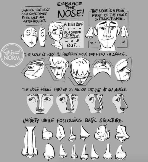
Wdym by distinctive nose?
(this was what i said was one of my "signature" OC traits in some tags awhile back)
noses are one of my favorite features to draw, so i put all my Best Shapes in the nose. i try to give each character a different one (unless they're related), because it's fun!

noses (੭ ˊᵕˋ)੭
Hello! I hope you dont mind me asking, but how do you draw those amazing black and white comics? (Coffee and The Goddess comics come to mind!) I love the way you do them and would love to know the process you go thru!
this is a pretty broad question and im guessing/hoping you meant “how do you color in black and white in your comics” so have a few random tips about values and paneling and stuff i guess


thank you
HELP TO MY BELOVED ARTISTS
References is the artist best friend!!!
so here it is some resources for you to use! Please share, so you can help more artist uwu.
i can update this post if i find new things.
LAY FIGURE:
JustSketchMe
Magic Poser Web
Design Doll (this one isn't online, and you have to download)
Easy Pose on Steam (this one isn't a free app, and is more focused on "anime art style")
3D MODEL:
Female body - Sketchfab
Male body - Sketchfab
a lot of poses - POSEMANIACS
Reference Angle
Head Construction - guidelines - by Marc Brunet.
BACKGROUND:
Room Sketcher
SketchUp
BLOGS THAT HELP A LOT:
this amazing post made by starrify-everything
Pose Reference
BONUS:
this amazing hands brushes made by poxamarquinhos
a lot of pinterest bases
Heres a MEGA folder filled with art book pdfs, if anyone has some others that you'd like me to add to it thats missing, please let me know and send me the link
EDIT 1: If you're a bit new to art and you're super overwhelmed by the options and you don't know where to start, I highly recommend the morpho series of books
Edit 2:No more Google Drive, just the MEGA folder now, so don't panic if the stuff on Google ain't there no more, its still up, just in a different location

These are taken directly from the concept art. May not be the same as what was used in the shows.
I will edit post with hexcodes.
Hey guys, you know about the Same Energy website right? has someone made a post about that? Cuz otherwise im gonna sing its praises to high heaven for its artistic references