Your gateway to endless inspiration
Satellite Images - Blog Posts
Countdown to Launch of Landsat 9
We’re launching Landsat 9 — the ninth in a series of satellite missions from NASA and the U.S. Geological Survey (USGS) that have been collecting images of our planet for almost 50 years. Follow along as we count down to launch!

A normal launch countdown starts at 10, but for Landsat 9, we’re jumping in with L-9!
There are 9 million images in the USGS/NASA Landsat archive! They’re all available for free, for use by scientists, data managers, and anyone else who’s interested. You can even download them!

Landsat 9 won’t be orbiting alone. Working together, Landsat 9 and Landsat 8 will completely image Earth every 8 days! This helps us track changes on the planet’s surface as they happen in near-real-time.

Landsat sees all 7 continents! From Antarctic ice to growing cities to changing forests, Landsat measures land — and coastal regions — all around the globe.

Working in space is really hard. Landsat 6 never made it to orbit, an important reminder that failures can be opportunities to learn and grow. Shortly after the unsuccessful launch, engineers got to work on Landsat 7, which is still collecting data today — 22 years later.

We have 5 decades of Landsat observations, the longest continuous record of Earth’s land surfaces in existence! While building the original Landsat in the 1970s, it would have been hard to imagine that this mission would still be providing crucial data about our planet today.

For each color band collected, Landsat 9 will see 4 times the shades of light as the previous Landsat mission! With more than 16,000 different intensities detected, Landsat 9 will be able to see crucial details on our planet’s surface.

Our eyes detect 3 colors of light: red, green, and blue — and Landsat does too! But Landsat 9 also detects wavelengths that can be combined to measure things our eyes can’t, like crop stress, coral reef health, fires, and more.

There are 2 instruments on Landsat 9! The Operational Land Imager 2 collects light, and works kind of like our eyes — or cameras — to make data-rich images. The Thermal Infrared Sensor 2 measures temperature, helping monitor plant health, fires, and more.

The Landsat program is the result of 1 amazing partnership! For more than 50 years, we’ve worked with the U.S. Geological Survey to design, build, launch, and manage Landsat satellites.

Two agencies working together makes for the longest continuous record of Earth’s surfaces. Now, let’s launch this satellite!
Make sure to follow us on Tumblr for your regular dose of space!
Take a Road Trip through Time with Landsat 9
A lot can change in five decades! How we talk, what we wear – it all evolves. But one thing that’s stayed consistent is our unique view of our home planet from above. Five decades ago, we at NASA partnered with United States Geological Survey (USGS) to launch a satellite called Landsat to see Earth from space. Now, we’re launching Landsat 9 – that’s right, the ninth in the series!

Join us for a road trip through the decades from the idea of an Earth-imaging satellite in the groovy 60s to the launch of Landsat 9 this year. Hop in!

The 60s
Far out! In 1966, USGS proposed a satellite to image land all around our planet. Researchers worked with our scientists and engineers to design the satellite and figure out how it would work.

The 70s
Here’s the lowdown: In 1970, we got approval to build the Earth Resources Technology Satellite, later renamed Landsat 1. The satellite launched in 1972 and provided the first digital data of Earth, repeated at regular intervals, which allows us to see changes as they happen.

The 80s
In 1982, we launched Landsat 4, followed by Landsat 5 in 1984. These two satellites collected more wavelengths of light at higher precision, allowing for natural color images, which is totally radical, dude.

The 90s
Wasssup, 1990s? Landsat 7 launched this decade, collecting even more data than previous Landsat satellites, enough to produce the first hi-res natural color map of remote Antarctica.

The 2000s
In 2008, our partners at USGS made all Landsat data available for free. This gave peeps around the world access to all the data they needed, unlocking innovation and creating economic benefits, like the ability to track crop health from space. Sweet!

The 2010s
In 2013, Landsat 8 began the modern era of Landsat observations. A new style of sensor and ground system made it possible to download much more and better data than ever before. Plus, a partnership with European Space Agency’s Sentinel-2 satellites gives even more regular observations. We heart that!

The 2020s
Now, we’re set to launch Landsat 9, a twin to Landsat 8. Two Landsat satellites with two instruments each will highkey change our view of Earth once again.

Now, on to the next 50 years of Earth observations! Stay tuned to watch Landsat 9 launch and start telling us even more about our home planet.
Make sure to follow us on Tumblr for your regular dose of space.
Which Landsat Image Do You Love?
Feeling competitive? We’ve got a game for you to play in! Tournament Earth: The Landsat Games is happening right now, and as we get to the final entries, the competition is heating up.

You can help us pick the winner by voting for one of the remaining four Landsat images of our home planet! Our competition started with 32 images, divided into categories by what they show: land, water, ice & snow, and human impact.
So, what do you think? Which one of these images is going for gold?
Land
First up, we have an image of the Markha River and surrounding Central Siberian Plateau, acquired in 2020 by Landsat 8. The hypnotic undulations of striping across the landscape carried this image to victory over the rest of the Land images -- a particularly tough category, given that these images all come from Landsat.

Water
It’s not all land, though! The bright blues and greens of this false-color image of the Atchafalaya Delta in Louisiana helped carry it to victory in the Water category. The image, taken in 2020 by Landsat 8, shows a region that’s subject to erosion of land by wind and rising sea levels.

Ice & Snow
Brrr! Did it get cold in here? That’s the finalist from the Ice and Snow category, an image of sea ice around Russia’s New Siberian Islands. The image, collected by Landsat 8 in June 2016, shows sea ice during its annual seasonal breakup.

Human Impact
Humans have been shaping the planet around us for hundreds of years. Some changes, like rice fields in the Sacramento Valley, are visible from space. Landsat 8 collected this false-color image of flooded rice fields in December 2018.

So, now it’s up to you! Which image is your favorite? There can only be one winner of Tournament Earth: The Landsat Games. Get your vote in, and then get ready to watch as we launch the next Landsat satellite, Landsat 9, in September.

The Landsat mission is a partnership between us at NASA and the U.S. Geological Survey. Together, we’ve been using Landsat satellites to collect nearly 50 years of images of our home planet.
Make sure to follow us on Tumblr for your regular dose of space.
21 Years of Amazing Earth Imagery
On April 29, 1999, NASA Earth Observatory started delivering science stories and imagery to the public through the Internet. Today, we turn 21! So much has changed in the past two decades...
One of the most notable changes is the way we view our home planet. Check out some of the beautiful imagery of our planet over the past 21 years.
2000: Pine Island Glacier

Most people will never see Pine Island Glacier in person. Located near the base of the Antarctic Peninsula—the “thumb” of the continent—the glacier lies more than 2,600 kilometers (1,600 miles) from the tip of South America. That’s shorter than a cross-country flight from New York to Los Angeles, but there are no runways on the glacier and no infrastructure. Only a handful of scientists have ever set foot on its ice.
This animation shows a wide view of Pine Island Glacier and the long-term retreat of its ice front. Images were acquired by the Moderate Resolution Imaging Spectroradiometer (MODIS) on our Terra satellite from 2000 to 2019. Notice that there are times when the front appears to stay in the same place or even advance, though the overall trend is toward retreat. Read more.
2002: The Blue Marble

In February 2002, Earth Observatory published this “blue marble” image based on the most detailed collection of true-color imagery of the entire Earth at that time. Using a collection of satellite-based observations, scientists and visualizers stitched together months of observations of the land surface, oceans, sea ice and clouds into a seamless, true-color mosaic of every square kilometer (.386 square mile) of our planet. Most of the information contained in this image came from Moderate Resolution Imaging Spectrometer (MODIS), illustrating the instrument's outstanding capacity to act as an integrated tool for observing a variety of terrestrial, oceanic and atmospheric features of the Earth. Read more.
2009: Tsauchab River Bed

The Tsauchab River is a famous landmark for the people of Namibia and tourists. Yet few people have ever seen the river flowing with water. In December 2009, an astronaut on the International Space Station caught this glimpse of the Tsauchab River bed jutting into the sea of red dunes. It ends in a series of light-colored, silty mud holes on the dry lake floor.
Like several other rivers around the Namib Desert, the Tsauchab brings sediment down from the hinterland toward the coastal lowland. This sediment is then blown from the river beds, and over tens of millions of years it has accumulated as the red dunes of the Namib Sand Sea. Read more.
2012: Manning Island and Foxe Basin, Canada

Although it may look like a microscope’s view of a thin slice of mineral-speckled rock, this image was actually acquired in space by the Earth Observing-1 satellite in July 2012. It shows a small set of islands and a rich mixture of ice in Foxe Basin, the shallow northern reaches of Hudson Bay.
The small and diverse sizes of the ice floes indicate that they were melting. The darkest colors in the image are open water. Snow-free ice appears gray, while snow-covered ice appears white. The small, dark features on many of the floes are likely melt ponds. Read more.
2013: A Lava Lamp Look at the Atlantic

Stretching from tropical Florida to the doorstep of Europe, this river of water carries a lot of heat, salt, and history. The Gulf Stream is an important part of the global ocean conveyor belt that moves water and heat across the North Atlantic from the equator toward the poles. It is one of the strongest currents on Earth, and one of the most studied.
This image shows a small portion of the Gulf Stream as it appears in infrared imagery. Data for this image was acquired on April 9, 2013, by the Thermal Infrared Sensor (TIRS) on the Landsat 8 satellite. TIRS observes in wavelengths of 10.9 micrometers and 12.0 micrometers. The image above is centered at 33.06° North latitude, 73.86° West longitude, about 500 kilometers (300 miles) east of Charleston, South Carolina. Read more.
2016: Curious Ensemble of Wonderful Features

When John Wesley Powell explored the Colorado River in 1869, he made the first thorough survey of one of the last blank spots on the map. The expedition began in May at Green River, Wyoming, and ended three months later at the confluence of the Colorado and Virgin Rivers in present-day Nevada.
About two months into their journey, the nine men of the expedition found themselves in Glen Canyon. As the men traveled along the serpentine river channel, they encountered what Powell later described in Canyons of Colorado as a “curious ensemble of wonderful features.”
From above, the view of Glen Canyon is equally arresting. In 2016, an astronaut aboard the International Space Station took several photographs that were combined to make a long mosaic. The water has an unnatural shade of blue because of sunglint, an optical phenomenon that occurs when sunlight reflects off the surface of water at the same angle that a camera views it. Click here to see the long mosaic.
2019: Lena Delta Shakes Off Water

For most of the year, the Lena River Delta—a vast wetland fanning out from northeast Siberia into the Arctic Ocean—is either frozen over and barren or thawed out and lush. Only briefly will you see it like this.
After seven months encased in snow and ice, the delta emerges for the short Arctic summer. The transition happens fast. The animation above, composed of images from the Moderate Resolution Imaging Spectroradiometer (MODIS) on our Aqua satellite, shows the transformation from June 3-10, 2019. Read more.
2020: Making Waves in the Andaman Sea

When tides, currents and gravity move water masses over seafloor features, they can create wave actions within the ocean. Oceanographers began studying these internal waves from ships in the 1960s, and the modern era of satellites has made it possible to see them on a grand scale. The Operational Land Imager (OLI) on Landsat 8 captured these images of the Andaman Sea on November 29, 2019. The reflection of the Sun on the ocean—sunglint—helps make the internal waves visible.
Internal waves form because the ocean is layered. Deep water tends to be colder, denser and saltier, while shallower water is often warmer, lighter and fresher. The differences in density and salinity cause layers of the ocean to behave like different fluids. When tides, currents, gravity and Earth’s rotation move these different water masses over seafloor formations (such as ridges or canyons), they create waves within the sea. Read more.
These images were taken from NASA Earth Observatory!
Interested in receiving Earth Observatory's Images of the Day? Subscribe to our newsletters or RSS feeds.
Make sure to follow us on Tumblr for your regular dose of space: http://nasa.tumblr.com.
Looking 50 Years in the Future with NASA Earth Scientists
In the 50 years since the first Earth Day, the view from space has revolutionized our understanding of Earth’s interconnected atmosphere, oceans, freshwater, ice, land, ecosystems and climate that have helped find solutions to environmental challenges.
If NASA’s Earth science has changed this much in 50 years, what will it look like in 50 more years?
We asked some researchers what they thought. Here are their answers, in their own words.

Mahta Moghaddam is a professor of electrical and computer engineering at the University of Southern California. She’s building a system that helps sensors sync their measurements.
I am interested in creating new ways to observe the Earth. In particular, my team and I are building and expanding a system that will allow scientists to better study soil moisture. Soil moisture plays a vital role in the water and energy cycle and drives climate and weather patterns. When soil is wet and there is enough solar radiation, water can evaporate and form clouds, which precipitate back to Earth. Soil also feeds us – it nourishes our crops and sustains life on Earth. It’s one of the foundations of life! We need to characterize and study soil in order to feed billions of people now and in the future.

Our novel tool aims to observe changes in soil moisture using sensors that talk to each other and make decisions in real time. For instance, if one sensor in a crop field notes that soil is dry in a plot, it could corroborate it with other sensors in the area and then notify a resource manager or decision maker that an area needs water. Or if a sensor in another location senses that soil moisture is changing quickly due to rain or freeze/thaw activity, it could send a command to launch a drone or even to notify satellites to start observing a larger region. We live in one big, connected world, and can and will use many different scales of observations – local to global – from point-scale in-situ sensors to the scales that can be covered by drones, airplanes, and satellites. In just a few years from now, we might see much more vastly automated systems, with some touching not only Earth observations, but other parts of our lives, like drone deliveries of medical tests and supplies.

Odele Coddington is a scientist at the Laboratory for Atmospheric and Space Physics at the University of Colorado, Boulder. She’s building an instrument to measure how much solar energy Earth reflects back into space.
My research is focused on the Earth system response to the Sun’s energy. I spend half of my time thinking about the amount and variability of the Sun’s energy, also known as the solar irradiance. I’m particularly interested in the solar spectral irradiance, which is the study of the individual wavelengths of the Sun’s energy, like infrared and ultraviolet. On a bright, clear day, we feel the Sun’s warmth because the visible and infrared radiation penetrate Earth’s atmosphere to reach the surface. Without the Sun, we would not be able to survive. Although we’ve been monitoring solar irradiance for over 40 years, there is still much to learn about the Sun’s variability. Continuing to measure the solar irradiance 50 years from now will be as important as it is today.

I spend the other half of my time thinking about the many processes driven by the Sun’s energy both within the atmosphere and at the surface. I’m excited to build an instrument that will measure the integrated signal of these processes in the reflected solar and the emitted thermal radiation. This is my first foray into designing instrumentation and it has been so invigorating scientifically. My team is developing advanced technology that will measure Earth’s outgoing radiation at high spatial resolution and accuracy. Our instrument will be small from the onset, as opposed to reducing the size and mass of existing technology. In the future, a constellation of these instruments, launched on miniaturized spacecraft that are more flexible to implement in space, will give us more eyes in the sky for a better understanding of how processes such as clouds, wildfires and ice sheet melting, for instance, alter Earth’s outgoing energy.

Sujay Kumar is a research physical scientist at NASA’s Goddard Space Flight Center. He works on the Land Information System.
Broadly, I study the water cycle, and specifically the variability of its components. I lead the development of a modeling system called the Land Information System that isolates the land and tries to understand all the processes that move water through the landscape. We have conceptual models of land surface processes, and then we try to constrain them with satellite data to improve our understanding. The outputs are used for weather and climate modeling, water management, agricultural management and some hazard applications.

I think non-traditional and distributed platforms will become more the norm in the future. So that could be things like CubeSats and small sats that are relatively cheaper and quicker than large satellites in terms of how much time it takes to design and launch. One of the advantages is that because they are distributed, you’re not relying on a single satellite and there will be more coverage. I also think we’ll be using data from other “signals of opportunity” such as mobile phones and crowd-sourced platforms. People have figured out ways to, for example, retrieve Earth science measurements from GPS signals.
I feel like in the future we will be designing our sensors and satellites to be adaptive in terms of what the observational needs on the ground are. Say a fire or flood happens, then we will tell the satellite to look over there more intensely, more frequently so that we can benefit. Big data is a buzzword, but it’s becoming a reality. We are going to have a new mission call NISAR that’s going to collect so much data that we really have to rethink how traditional modeling systems will work. The analogy I think of is the development of a self-driving car, which is purely data driven, using tons and tons of data to train the model that drives the car. We could possibly see similar things in Earth science.
Hear from more NASA scientists on what they think the future will bring for Earth science:
Make sure to follow us on Tumblr for your regular dose of space: http://nasa.tumblr.com.
🔎 Lava Lake Discovery
🌋 Raikoke Volcano Eruption
🔥 Uptick in Amazon Fire Activity
2019 brought many memorable events on Planet Earth, and NASA satellites and astronauts captured a lot of the action! From new discoveries to tracking natural events and capturing amazing scenery, here are a few highlights from around the globe.
Read more about the images in this video, here.
Moving at the Speed of Arctic Ice
Time-lapses taken from space can help track how Earth’s polar regions are changing, watching as glaciers retreat and accelerate, and ice sheets melt over decades.

Using our long data record and a new computer program, we can watch Alaskan glaciers shift and flow every year since 1972. Columbia Glacier, which was relatively stable in the 1970s, has since retreated rapidly as the climate continues to warm.

The Malaspina Glacier has pulsed and spread and pulsed again. The flashes and imperfect frames in these time-lapses result from the need for cloud-free images from each year, and the technology limitations of the early generation satellites.

In Greenland, glaciers are also reacting to the warming climate. Glaciers are essentially frozen rivers, flowing across land. As they get warmer, they flow faster and lose more ice to the ocean. On average, glaciers in Greenland have retreated about 3 miles between 1985 and 2018. The amount of ice loss was fairly consistent for the first 15 years of the record, but started increasing around 2000.

Warmer temperatures also affect Greenland farther inland, where the surface of ice sheets and glaciers melts, forming lakes that can be up to 3 miles across. Over the last 20 years, the number of meltwater lakes forming in Greenland increased 27% and appeared at higher elevations, where temperatures were previously too cold for melt.

Whether they're studying how ice flows into the water, or how water pools atop ice, scientists are investigating some of the many aspects of how climate affects Earth's polar regions.
For more information, visit climate.nasa.gov.
Make sure to follow us on Tumblr for your regular dose of space: http://nasa.tumblr.com.
What Does Two Decades of Rain and Snow Show Us?
You are seeing the culmination of almost twenty years of rain and snow, all at once.

For the first time, we have combined and remastered the satellite measurements from two of our precipitation spacecraft to create our most detailed picture of our planet’s rain and snowfall. This new record will help scientists better understand normal and extreme rain and snowfall around the world and how these weather events may change in a warming climate.

The Most Extreme Places on Earth
Using this new two-decade record, we can see the most extreme places on Earth.
The wettest places on our planet occur over oceans. These extremely wet locations tend to be very concentrated and over small regions.
A region off the coast of Indonesia receives on average 279 inches of rain per year.

An area off the coast of Colombia sees on average 360 inches of rain per year.

The driest places on Earth are more widespread. Two of the driest places on Earth are also next to cold ocean waters. In these parts of the ocean, it rains as little as it does in the desert -- they’re also known as ocean deserts!
Just two thousand miles to the south of Colombia is one of the driest areas, the Atacama Desert in Chile that receives on average 0.64 inches of rain per year.

Across the Atlantic Ocean, Namibia experiences on average 0.49 inches of rain a year and Egypt gets on average 0.04 inches of rain per year.

Global Patterns
As we move from January to December, we can see the seasons shift across the world.

During the summer in the Northern Hemisphere, massive monsoons move over India and Southeast Asia.

We can also see dynamic swirling patterns in the Southern Ocean, which scientists consider one of our planet’s last great unknowns.

Close-up Patterns
This new record also reveals typical patterns of rain and snow at different times of the day -- a pattern known as the diurnal cycle.
As the Sun heats up Earth’s surface during the day, rainfall occurs over land. In Florida, sea breezes from the Gulf of Mexico and Atlantic Ocean feed the storms causing them to peak in the afternoon. At night, storms move over the ocean.

In the winter months in the U.S. west coast, the coastal regions generally receive similar amounts of rain and snow throughout the day. Here, precipitation is driven less from the daily heating of the Sun and more from the Pacific Ocean bringing in atmospheric rivers -- corridors of intense water vapor in the atmosphere.

This new record marks a major milestone in the effort to generate a long-term record of rain and snow. Not only does this long record improve our understanding of rain and snow as our planet changes, but it is a vital tool for other agencies and researchers to understand and predict floods, landslides, disease outbreaks and agricultural production.
Make sure to follow us on Tumblr for your regular dose of space: http://nasa.tumblr.com
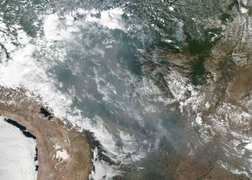
Fires in the Amazon Rainforest
This natural-color image shows smoke from fires in the Amazon rainforest spreading across several states within Brazil, including Amazonas, Mato Grosso, and Rondônia. The image was collected by our VIIRS (Visible Infrared Imaging Radiometer Suite) instrument aboard the Suomi NPP satellite (a joint-partnership between NASA and the National Oceanic and Atmospheric Administration) on August 20, 2019. It’s not unusual to see fires in Brazil at this time of year, but activity in the country’s largest state, Amazonas, has been above average. Many people use fire to maintain farmland and pastures or to clear land for other purposes.
Credits: NASA Worldview, Earth Observing System Data and Information System (EOSDIS).
Make sure to follow us on Tumblr for your regular dose of space: http://nasa.tumblr.com.
Our Eyes in the Sky See Toxic Waters
Warm summer temperatures often lead to dangerous blooms of phytoplankton in lakes, reservoirs and along our coastlines. These toxin-containing aquatic organisms can sicken people and pets, contaminate drinking water, and force closures at boating and swimming sites.

In this image, a severe bloom of toxic blue-green algae is spreading across the western half of Lake Erie. Taken on July 30, 2019 by the Operational Land Imager on our Landsat 8 satellite, this image shows green patches where the bloom was most dense and where toxicity levels were unsafe for recreational activities. Around the time of this image, the bloom covered about 300 square miles of Lake Erie’s surface, roughly the size of New York City. By August 13, the bloom had doubled to more than 620 square miles. That’s eight times the size of Cleveland.

The dominant organism—a Microcystis cyanobacteria—produces the toxin microcystin, can cause liver damage, numbness, dizziness, and vomiting. On July 29, 2019, the National Oceanic Atmospheric Administration (NOAA) reported unsafe toxin concentrations in Lake Erie and have since advised people (and their pets) to stay away from areas where scum is forming on the water surface.
You can stay informed about harmful algal blooms using a new mobile app that will send you alerts on potentially harmful algal blooms in your area. Called CyAN, it's based on NASA satellite data of the color changes in lakes and other bodies of water. It serves as our eye-in-the-sky early warning system, alerting the public and local officials to when dangerous waters may be in bloom.
Make sure to follow us on Tumblr for your regular dose of space: http://nasa.tumblr.com.
Hurricanes Have No Place to Hide, Thanks to Better Satellite Forecasts

If you’ve ever looked at a hurricane forecast, you’re probably familiar with “cones of uncertainty,” the funnel-shaped maps showing a hurricane’s predicted path. Thirty years ago, a hurricane forecast five days before it made landfall might have a cone of uncertainty covering most of the East Coast. The result? A great deal of uncertainty about who should evacuate, where it was safe to go, and where to station emergency responders and their equipment.

Over the years, hurricane forecasters have succeeded in shrinking the cone of uncertainty for hurricane tracks, with the help of data from satellites. Polar-orbiting satellites, which fly nearly directly above the North and South Poles, are especially important in helping cut down on forecast error.

The orbiting electronic eyeballs key to these improvements: the Joint Polar Satellite System (JPSS) fleet. A collaborative effort between NOAA and NASA, the satellites circle Earth, taking crucial measurements that inform the global, regional and specialized forecast models that have been so critical to hurricane track forecasts.

The forecast successes keep rolling in. From Hurricanes Harvey, Irma and Maria in 2017 through Hurricanes Florence and Michael in 2018, improved forecasts helped manage coastlines, which translated into countless lives and property saved. In September 2018, with the help of this data, forecasters knew a week ahead of time where and when Hurricane Florence would hit. Early warnings were precise enough that emergency planners could order evacuations in time — with minimal road clogging. The evacuations that did not have to take place, where residents remained safe from the hurricane’s fury, were equally valuable.

The satellite benefits come even after the storms make landfall. Using satellite data, scientists and forecasters monitor flooding and even power outages. Satellite imagery helped track power outages in Puerto Rico after Hurricane Maria and in the Key West area after Hurricane Irma, which gave relief workers information about where the power grid was restored – and which regions still lacked electricity.

Flood maps showed the huge extent of flooding from Hurricane Harvey and were used for weeks after the storm to monitor changes and speed up recovery decisions and the deployment of aid and relief teams.

As the 2019 Atlantic hurricane season kicks off, the JPSS satellites, NOAA-20 and Suomi-NPP, are ready to track hurricanes and tropical cyclones as they form, intensify and travel across the ocean – our eyes in the sky for severe storms.
For more about JPSS, follow @JPSSProgram on Twitter and facebook.com/JPSS.Program, or @NOAASatellites on Twitter and facebook.com/NOAASatellites.
Make sure to follow us on Tumblr for your regular dose of space: http://nasa.tumblr.com.
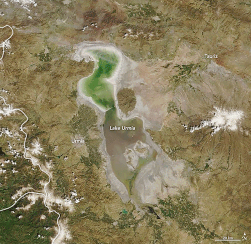
Reviving the Shriveled Lake Urmia
Once the second-largest saltwater lake in the Middle East, Lake Urmia attracted birds and bathers to bask in its turquoise waters in northwest Iran. Then beginning in the 1970s, nearly three decades of drought and high water demands on the lake shriveled the basin, shrinking it by 80 percent. Recent torrential rains have replenished the water levels of this aquatic gem once known as “the turquoise solitaire of Azerbaijan.”
The animation above shows Lake Urmia on April 9, 2018, and April 12, 2019. The images were acquired by the Moderate Resolution Imaging Spectroradiometer (MODIS) on our Terra satellite. Officials report that the lake’s surface area reached roughly 3,000 square kilometers (1,200 square miles) in April 2019—expanding its volume nearly two-fold from a year ago.
Read more about Lake Urmia here.
Make sure to follow us on Tumblr for your regular dose of space: http://nasa.tumblr.com.
Greenland Refrozen
It won’t be until summertime that a significant amount of melt shows up across the Greenland Ice Sheet. For now, most indications of meltwater ponds and lakes are leftovers from past seasons that have since refrozen.

These photographs were snapped during research flights for NASA’s Operation IceBridge—now in its final year after a decade of airborne missions to map polar ice.

This second image was acquired on April 18, 2019, with the Continuous Airborne Mapping by Optical Translator (CAMBOT) system. The system takes downward-looking images throughout a flight, which can later be used by scientists to interpret other data. This image shows part of a large, frozen lake on Storstrømmen Glacier. This lake also thaws in summertime, which is why it shows up as blue ice.
Lakes atop a glacier, or “supraglacial lakes,” are somewhat stable in terms of their location, according to Joe MacGregor, NASA project scientist for Operation IceBridge. The lake on Storstrømmen is visible in satellite data at least as far back as May 2012. On occasion, water in lakes like this can drain away through a vertical shaft known as a “moulin.” Scientists initially wondered if the dark circular area on the right side of this image could be a moulin, but closer inspection suggested it is just a deeper part of the lake.
See more photos of the frozen lakes in Greenland: https://earthobservatory.nasa.gov/images/144965/greenland-refrozen
Make sure to follow us on Tumblr for your regular dose of space: http://nasa.tumblr.com.
Earth: Our Oasis in Space

Earth: It’s our oasis in space, the one place we know that harbors life. That makes it a weird place -- so far, we haven’t found life anywhere else in the solar system...or beyond. We study our home planet and its delicate balance of water, atmosphere and comfortable temperatures from space, the air, the ocean and the ground.

To celebrate our home, we want to see what you love about our planet. Share a picture, or several, of Earth with #PictureEarth on social media. In return, we’ll share some of our best views of our home, like this one taken from a million miles away by the Earth Polychromatic Imaging Camera (yes, it’s EPIC).

From a DC-8 research plane flying just 1500 feet above Antarctic sea ice, we saw a massive iceberg newly calved off Pine Island Glacier. This is one in a series of large icebergs Pine Island has lost in the last few years – the glacier is one of the fastest melting in Antarctica.

It’s not just planes. We also saw the giant iceberg, known as B-46, from space. Landsat 8 tracked B-46’s progress after it broke off from Pine Island Glacier and began the journey northward, where it began to break apart and melt into the ocean.

Speaking of change, we’ve been launching Earth-observing satellites since 1958. In that time, we’ve seen some major changes. Cutting through soft, sandy soil on its journey to the Bay of Bengal, the Padma River in Bangladesh dances across the landscape in this time-lapse of 30 years’ worth of Landsat images.

Our space-based view of Earth helps us track other natural activities, too. With both a daytime and nighttime view, the Aqua satellite and the Suomi NPP satellite helped us see where wildfires were burning in California, while also tracking burn scars and smoke plumes..

Astronauts have an out-of-this-world view of Earth, literally. A camera mounted on the International Space Station captured this image of Hurricane Florence after it intensified to Category 4.

It’s not just missions studying Earth that capture views of our home planet. Parker Solar Probe turned back and looked at our home planet while en route to the Sun. Earth is the bright, round object.
Want to learn more about our home planet? Check out our third episode of NASA Science Live where we talked about Earth and what makes it so weird.
Make sure to follow us on Tumblr for your regular dose of space: http://nasa.tumblr.com
How NASA Earth Data Aids America

Today we roll out a new communications project that highlights some of the many ways that NASA's Earth observations help people strengthen communities across the United States.
Space for U.S. features stories on how Earth science data is used to make informed decisions about public health, disaster response and recovery and environmental protection. By highlighting advanced technology from a global perspective, our data helps provide people achieve groundbreaking insights.

For example, a family-owned coffee company in Maine used our sunlight, wind and temperature data to determine the placement of their power-generating solar wall.
Space for U.S. features 56 stories illustrating how our science has made an impact in every state in the nation as well as the District of Columbia, Puerto Rico and regions along the Atlantic, Pacific, Gulf of Mexico, and the Great Lakes.

For six decades, we've used the vantage point of space to better understand our home planet and improve lives. Using Space for U.S., you can browse through stories about how applied Earth science either by state or by topics such as animals, disasters, energy, health, land and water. Each click brings you a story about how people are putting NASA data to work.

Explore the true stories behind the innovative technology, groundbreaking insights, and extraordinary collaboration happening right here in the United States with Space for U.S.
Check out "Space for U.S." today! www.nasa.gov/spaceforus

For more information on NASA Earth, head to www.nasa.gov/Earth or https://appliedsciences.nasa.gov.
Make sure to follow us on Tumblr for your regular dose of space: http://nasa.tumblr.com.
10 Ground-breaking Earth Satellite Images from 2018
In 2018, our satellites captured beautiful imagery from throughout the solar system and beyond. However, some of our favorite visualizations are of this very planet. While this list is by no means exhaustive, it does capture some Earth satellite images from this year that are both visually striking as well as scientifically informative. This list also represents a broad variety of Earth’s features, as well as satellite instrumentation. Take a journey with our eyes in the sky!
10. Hurricane Florence

Before making landfall, Hurricane Florence churned in the Atlantic for a full two weeks — making it among the longest-lived cyclones of the 2018 season. When it finally did hit land on Sep. 14, the storm devastated the southeastern U.S. coast with intense winds, torrential rains and severe flooding.
This natural-color image was acquired by MODIS on the Terra Satellite on Sep. 12, 2018.
Images like this, as well as other satellite information, were used to anticipate the impact of the storm. Our Disasters Program created flood proxy maps that were shared with the Federal Emergency Management Agency (FEMA) and the National Guard to estimate how many and which communities would be most affected by the storm, in order to help prepare recovery efforts ahead of time.
9. Australia’s Lake Eyre Basin

The Lake Eyre Basin covers one-sixth of Australia and is one of the world’s largest internally draining river systems. However, the rivers supported by this system are ephemeral, meaning that they only run for short periods of time following unpredictable rain — the rest of the time, the Basin is a dry, arid desert.
However, when the heavy rain comes, the basin erupts in an explosion of green. In this false-color image captured by the Operational Land Imager (OLI) on Landsat 8 on Apr. 25, 2018, you can see how the vegetation completely envelops the spaces where the water has receded. (Flood water is indicated by light blue, and vegetation is indicated by light green.)
Satellites are an excellent tool for tracking greening events that are followed by flooding. These events offer opportunities for predictive tools as well as recreation.
8. Alaska’s Chukchi Sea

A Monet painting comes to life as the Chukchi Sea swirls with microscopic marine algae.
This image was captured off the Alaskan coast by OLI on Landsat 8 on Jun. 18, 2018. After the Arctic sea ice breaks up each spring, the nutrient-rich Bering Sea water mixes with the nutrient-poor Alaskan coastal water. Each type of water brings with it a different type of phytoplankton and the surface waters have just enough light for the algae to populate and flourish. The result is these mesmerizing patterns of turquoise and green.
This image represents one piece of much larger, incredibly complex ecosystem. While one would not normally associate the breaking up of sea ice with phytoplankton blooms, it is an intricate process of the phytoplankton life cycle. The size of the blooms have varied greatly from year to year, and experts are unsure why. Images like these can help scientists track the development of these blooms and link it to other environmental changes.
7. Hawaii’s Kilauea

Sometimes fresh lava is best viewed in infrared.
This false-color image of Kilauea, captured by OLI on Landsat 8 on May 23, 2018, shows the infrared signal emitted by lava flowing toward the sea. The purple areas surrounding the glowing lava are clouds lit from below, indicating that this image was taken through a break in the clouds.
The Puʻu ʻŌʻō Kupaianaha eruption has been continuously spewing red-hot lava since 1983, making it the longest eruption at Kilauea in recorded history. However, new fissures opened up this year that forced many to evacuate the area. Hawaii’s largest lake evaporated in hours and hundreds of homes were destroyed in Vacationland and Kapoho.
Imagery, seismometers and ground-based instruments were used to track the underground movement of magma. Infrared imagery can be incredibly helpful in disasters like this when you to view data that cannot be observed with the naked eye.
6. California’s Woolsey Burn Scar

Nothing quite encapsulates the destruction of a wildfire like a photo from outer space.
This image of the Woolsey Fire aftermath in Southern California was captured on Nov. 18, 2018 by the Advanced Spaceborned Thermal Emission and Reflection Radiometer (ASTER) on the Terra satellite. This false-color infrared image has been enhanced to clearly show the burned vegetation (indicated by brown) and the vegetation that survived unscathed (indicated by green).
The Woolsey Fire clearly left its mark, with almost 152 square miles (394 square km) and 88% of the Santa Monica Mountains National Recreation Area badly burned. Images like this one can assist fire managers in the area plan for recovery.
5. Bangladesh’s Padma River

As the years go by, the Padma River grows and shrinks, twists and turns. It never has a fixed shape, and as a result, thousands of people must regularly adapt to the constant changes in the river’s 75-mile (130-km) shoreline.
This image captured on Jan. 20, 2018 by OLI on Landsat 8 depicts one of the major rivers of Bangladesh. For thirty years, scientists have been tracking the erosion of the river with satellite imagery. Combinations of shortwave infrared, near infrared, and visible light are used to detect differences year-to-year in width, depth, and shape of the river. Sometimes the river splits off, but then rejoins again later. These patterns are created by the river carrying and depositing sediment, shaping the curves of the path of water.
Monitoring the Padma River is going to become especially important as a new bridge development project advances in the Char Janajat area. Although the bridge will most certainly help shorten travel times for citizens, nobody is quite sure how the river erosion might affect the construction and vice versa.
4. Alaska’s Yakutat Glacier

It’s hard to believe that Harlequin Lake was once all dry land — but it only started to form once Yakutat Glacier started melting. The lake appeared at the beginning of the twentieth century, and has been growing rapidly ever since.
In this hauntingly beautiful image, captured on Sep. 21 2018 by OLI on Landsat 8, the effect of climate change is apparent — especially when compared to earlier images of the region.
Unless the climate warming starts to reverse very soon — which scientists consider very unlikely — Yakutat could be gone as soon as 2070.
3. South Africa’s Theewaterskloof

Cape Town is a seaside city planted on the tip of South Africa. It’s a city known for its beaches and biodiversity — it also almost became known as the first major city to officially run out of water.
This image of Cape Town’s largest reservoir — Theewaterskloof — was acquired on Jul. 9th, 2018 by OLI on Landsat 8. By the time this photo was taken, the city’s main reservoirs stood at 55%. This was a huge increase from where it stood just six months earlier: just 13%.
The severe water shortage in the region started in 2015, only to become more threatening after three successive and unusually dry years. The entire city was preparing for Day Zero — the day the tap water would be shut off.
Despite forecasts that Day Zero would arrive in April, a combination of heavier rains and local conservation efforts restored the majority of the reservoir.
2. Aerosol Earth

Aerosols are all around us. From the smoke from a fire, to the dust in the wind to the salt in sea spray — these solid particles and liquid droplets are always swirling in our atmosphere, oftentimes unseen.
The Goddard Earth Observing System Forward Processing (GEOS FP) model uses mathematical equations to model what is happening in our atmosphere. The inputs for its equations — temperature, moisture, wind, etc. — come from our satellites and ground sensors.
This visualization was compiled on Aug. 24, 2018 — obviously a busy day for aerosols in our atmosphere. Swirls of sea salt (indicated by blue) reveal typhoons Soulik and Cimaron heading straight towards South Korea and Japan. A haze of black carbon (indicated by red) suffuse from agricultural burning in Africa and large wildfires in North America. And clouds of dust (indicated by purple) float off the Sahara desert.
1. Camp Fire

With nearly a hundred fatalities, hundreds of thousands of acres burned and billions of dollars of damage, the world watched in horror as Camp Fire grew to become the most destructive California wildfire in recorded history.
This image was captured on Nov. 8, 2018 by OLI on Landsat 8 on the same day Camp Fire ignited. It consolidates both visible light and shortwave-infrared light in order to highlight the active fire. Strong winds and dry conditions literally fanned the flames and spread this wildfire like a rash.
This image has not only become the iconic portrait for Camp Fire, it is also sobering representation of how quickly a fire can grow out of control in a short amount of time. Even from space, you can almost smell the massive plumes of smoke and feel the heat of the fires.
Whether you realize it or not, our Earth satellite missions are collecting data everyday in order to monitor environmental changes and prepare for natural disasters. If your interest is piqued by this list, head over to the Earth Observatory. The Earth Observatory updates daily with fresh, new content — brought to you by none other than our eyes in the sky.
Make sure to follow us on Tumblr for your regular dose of space: http://nasa.tumblr.com
The Darkness that Followed Hurricane Michael
Earlier this month, the southeastern United States was struck by Hurricane Michael. After the category 4 storm made landfall on Oct. 10, 2018, Hurricane Michael proceeded to knock out power for at least 2.5 million customers across Florida, Georgia, North Carolina, and Virginia.

In this data visualization, you can clearly see where the lights were taken out in Panama City, Florida. A team of our scientists from Goddard Space Flight Center processed and corrected the raw data to filter out stray light from the Moon, fires, airglow, and any other sources that are not electric lights. They also removed atmosphere interference from dust, haze, and clouds.

In the visualization above, you can see a natural view of the night lights—and a step of the filtering process in an effort to clean up some of the cloud cover. The line through the middle is the path Hurricane Michael took.

Although the damage was severe, tens of thousands of electric power industry workers from all over the country—and even Canada—worked together to restore power to the affected areas. Most of the power was restored by Oct. 15, but some people still need to wait a little longer for the power grids to be rebuilt. Read more here.
Make sure to follow us on Tumblr for your regular dose of space: http://nasa.tumblr.com.